


Mobile App Conceptual Design - 2021
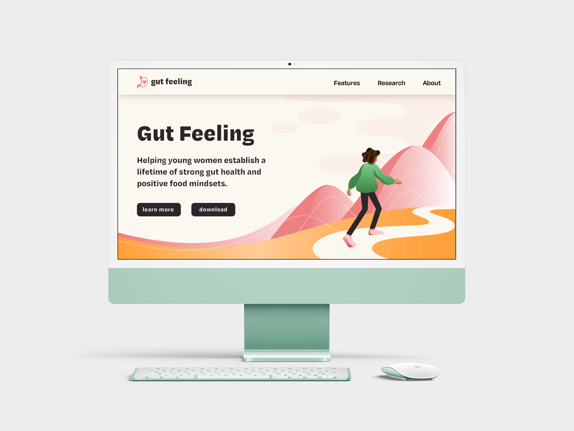
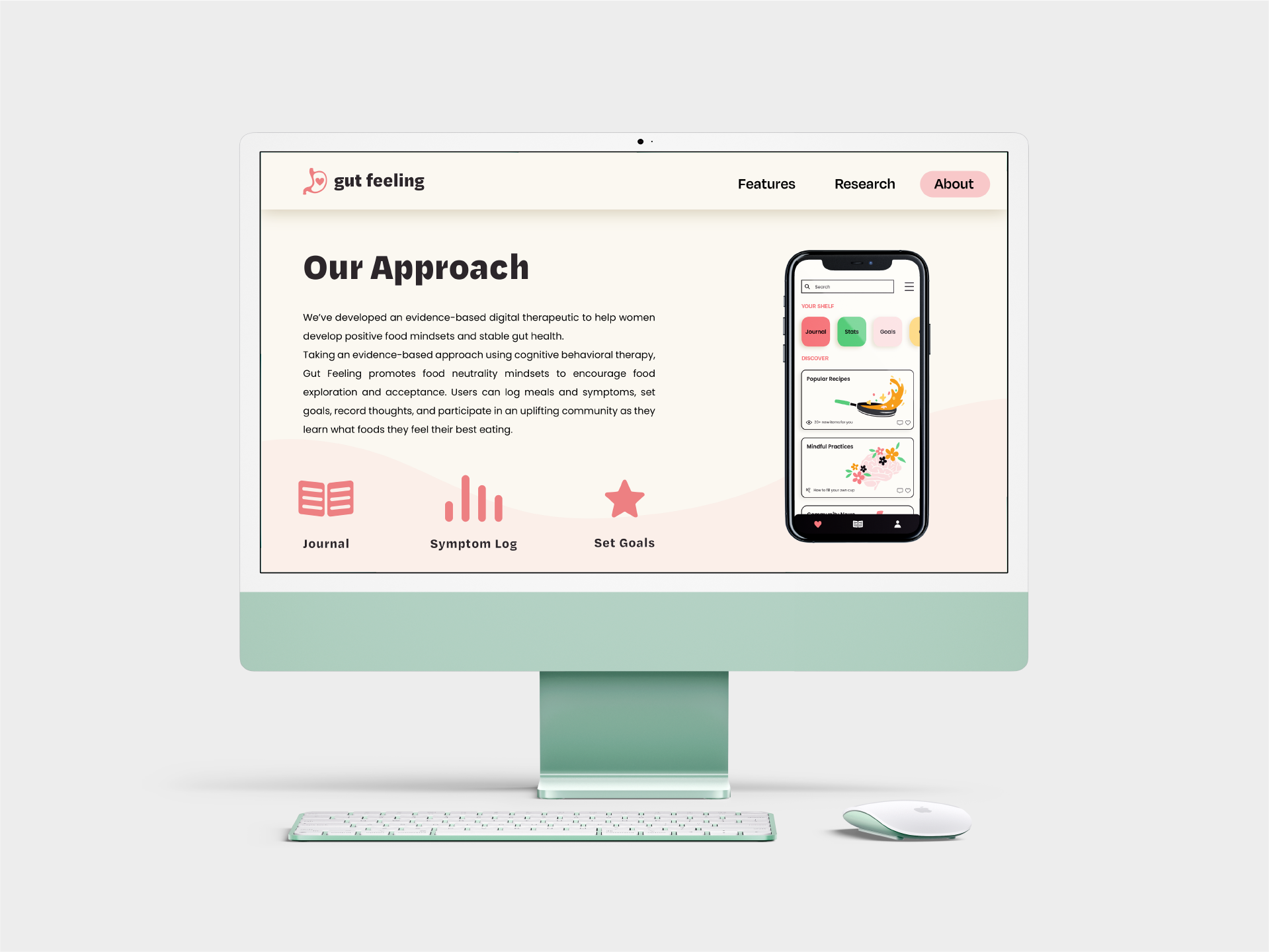
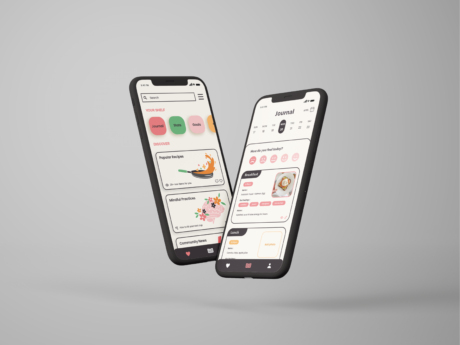
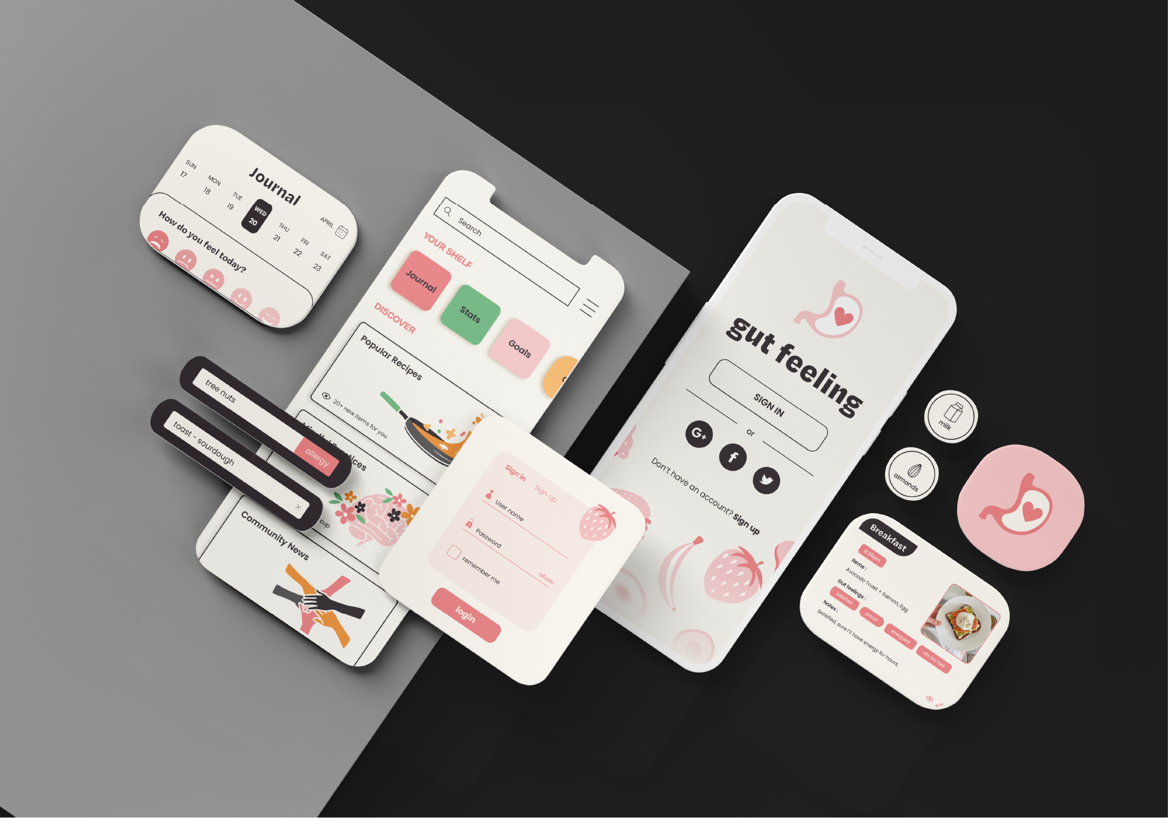
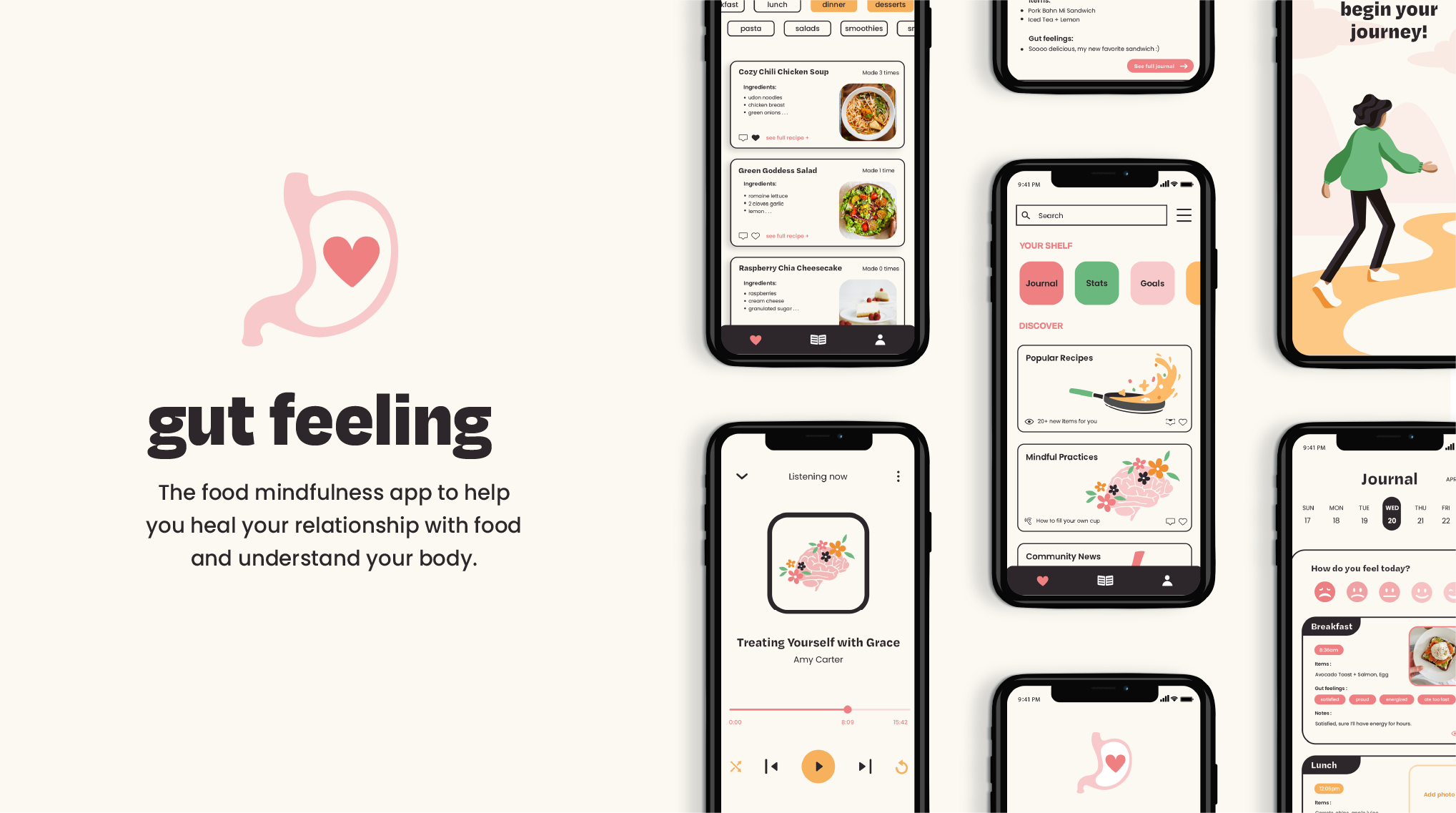
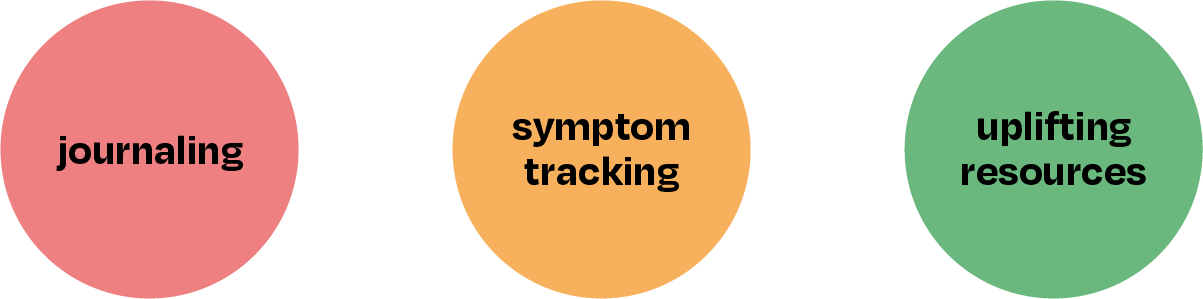
Gut Feeling is a digital therapeutic based in cognitive behavioral therapy, aiming to help women develop positive food mindsets and stable gut health. Centered around unlearning dichotomous thinking related to food, users can log meals, track symptoms, set goals, record thoughts, and participate in the community.
Women between the ages of 15 to 25 who struggle with food dichotomy thinking, food sensitivities, gut health, or eating disorders. Ideal for individuals who seek a more hands-on approach; seeing the most improvement when able to actively document thoughts and experiences.

Society perpetuates food dichotomy thinking, causing many individuals to fall victim to restrictive mindsets, eating disorders, and gut health complications.
Food journaling is a form of cognitive behavioral therapy proven to support positive eating behaviors and uncover food sensitivities. Practices such as symptom and behavior tracking promote mindfulness and often uncovers trends.
However, the vast majority of food journaling apps are calorie-centric, a characteristic that can misconstrue the nutritional value of foods and perpetuate dichotomous thinking.
The Question: How can users reap the benefits of food journaling to create long-term lifestyle improvements without falling victim to these dangerous side effects?
What's missing from this equation is a way for users to focus on the qualitative aspects of food in order to establish a comprehensive understanding of what makes their body feel best.
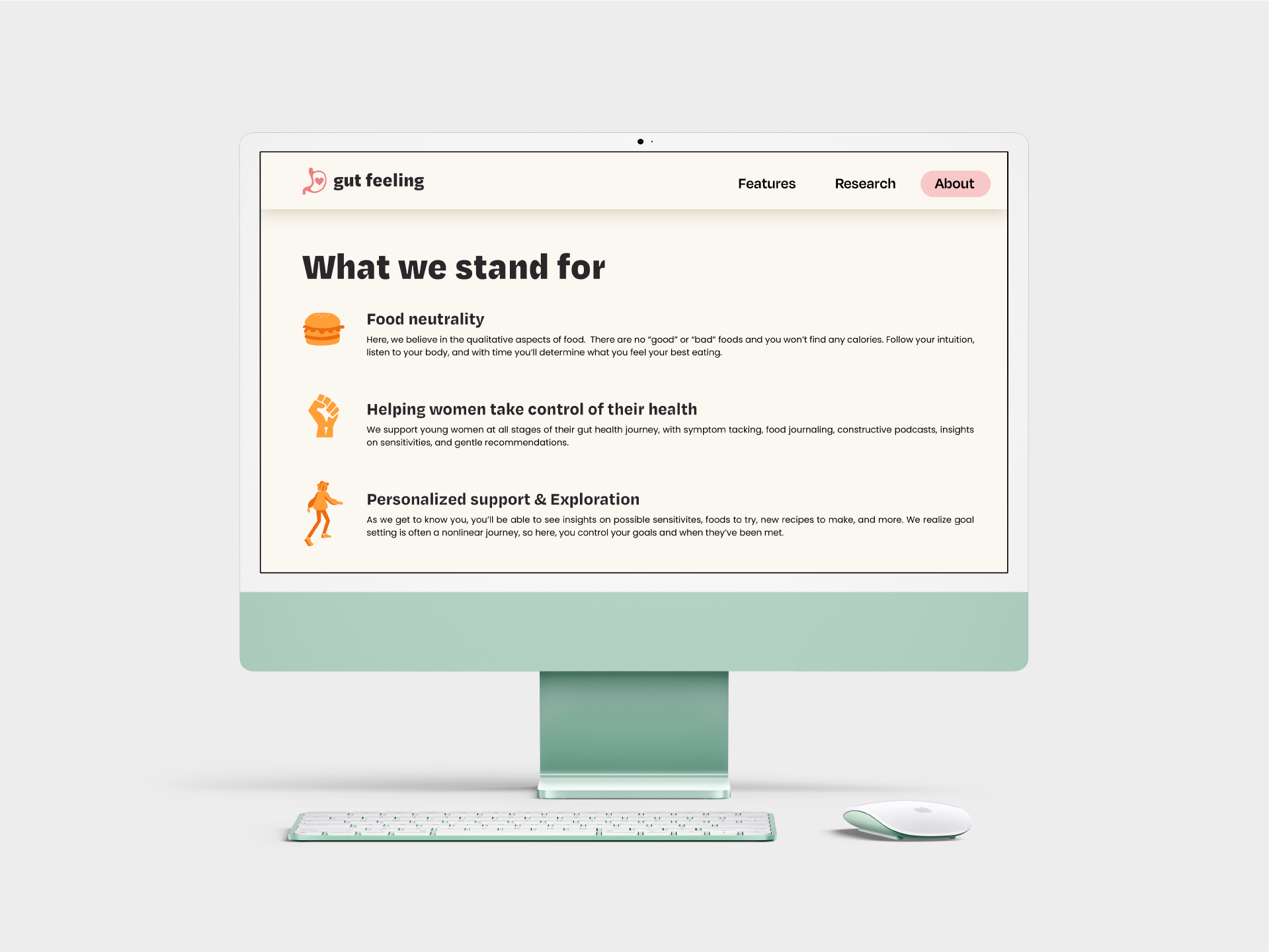
Users will be encouraged to practice mindfulness, balance, and a holistic approach to eating that prioritizes food neutrality. Thus, calories will not be found in this app, users will instead focus on qualitative aspects of food.
As users track their food along with qualitative variables such as symptoms, emotions, feelings, etc. the app will be able to make more informed and specific suggestions on symptom patterns, sensitivities, likes, dislikes, options to try, etc.
Goal: Create an autonomous digital therapeutic exclusively focused on the qualitative aspects of food/eating experience to promote a lifetime of balanced food mindsets and strong gut health.
Longterm Benefits: Users focused on eating to feel good without the restrictions of food dichotomy we see in diets, will naturally gravitate towards nutrient-dense foods over time as they notice trends and symptoms of their food intake. The mental and physical health benefits of this will follow, building a strong foundation for a lifetime of balance.
Cognitive Behavioral Therapy (CBT) is an evidence-based treatment used to produce cognitive and behavioral changes in users to improve health and wellness.
This app offers a holistic approach to managing gut health and food dichotomy thinking by targeting symptoms, as well as the users thoughts, emotions, and behaviors surrounding those symptoms.
This offers a strong treatment solution because it's low risk, autonomous, and the effects stay with the user long after they are done using the app.
Key Takeaways:
Women suffer significantly more than men from disordered eating, and more specifically young women between mid-teens to late 20’s. These disorders have the highest mortality rates of any psychiatric illness, yet only 27% of sufferers seek help, the main reason being embarrassment.
I gathered research from studies in trials analyzing the effects of dichotomous thinking and intuitive eating on eating behaviors of young adults. Health app retention rates in young adults show intuitive eating consistently predicted lower levels of disordered eating and body image concerns. In tangent, low levels of dichotomous thinking also mediated the relationship between intuitive eating and disordered eating.
Self monitoring apps which employ the use of cognitive behavioral therapy show effective behavior change in young adults. A private, autonomous app also addresses the challenge in individuals choosing not to seek care due to being embarrassment. This could have potential to be a supplementary treatment prescription, but it should be known that more serious conditions need to seek help from a medical professional.
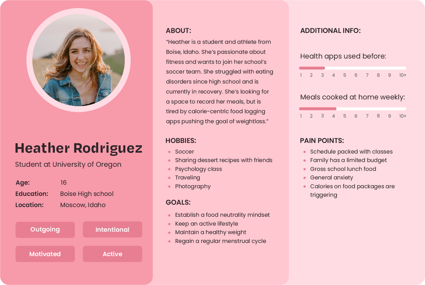
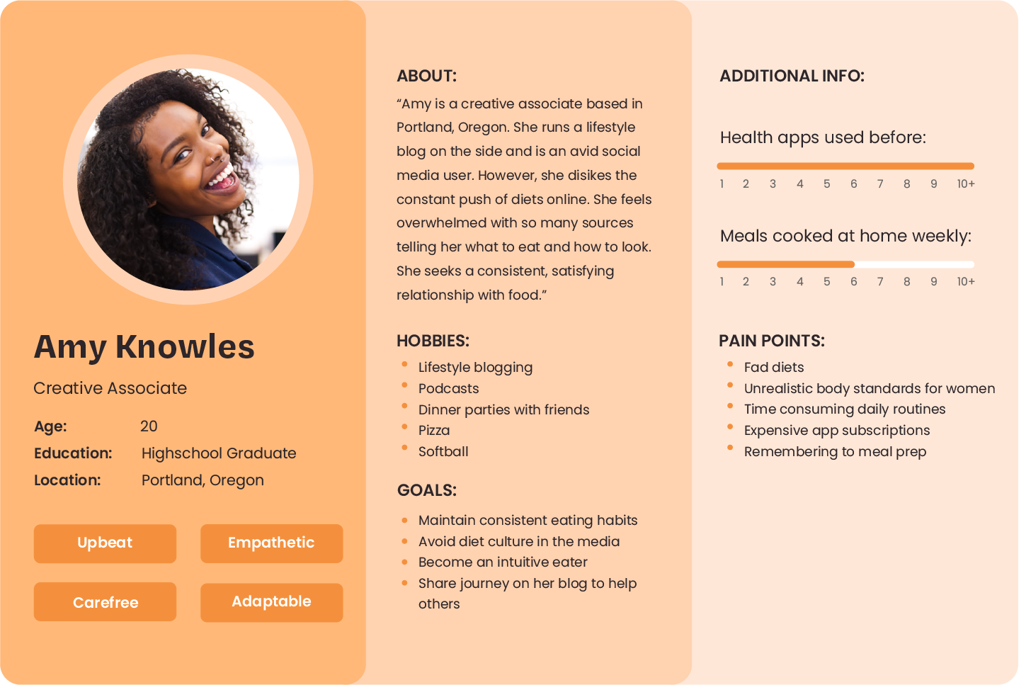
Shown below are three user personas, these help bring to life who our ideal user would be. As mentioned above, this app's ideal users include women between the ages of 15 to 25 who have struggled with food dichotomy thinking, food sensitivities, gut health, or eating disorders. Here they are provided with a hands-on approach to actively document their thoughts and experiences.

- Calories/Weight triggers
- Disordered eating experience
- Time consuming routinesVisually unattractive app interfaces
- Lack of knowledge on nutrition basics
- Limited cooking skills
- Fad diets
- Limited budget
- Expensive app subscriptions
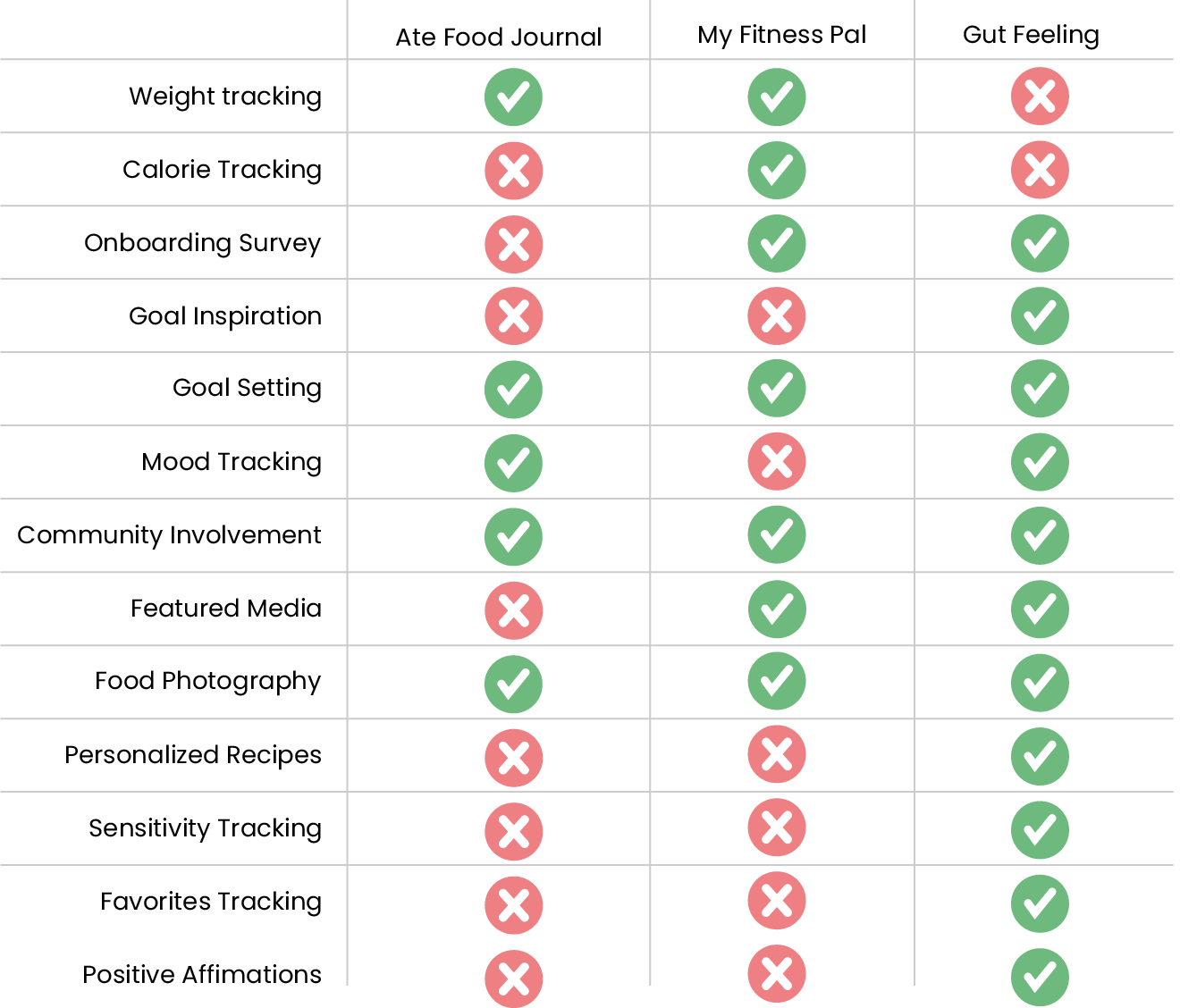
This analysis gives a better idea of some other apps which are also active within the digital health, and more specifically, food journaling realm. We can then determine what can be done to provide better features and craft a superior user experience.
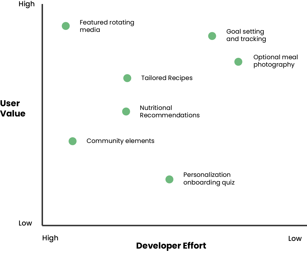
This graph lays out the importance of different functions within the app. This helps to visualize which components will take the most effort to build, what will serve the users' needs best, and how allocate time properly.
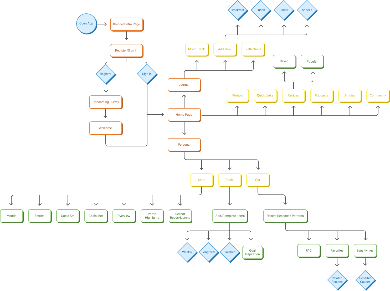
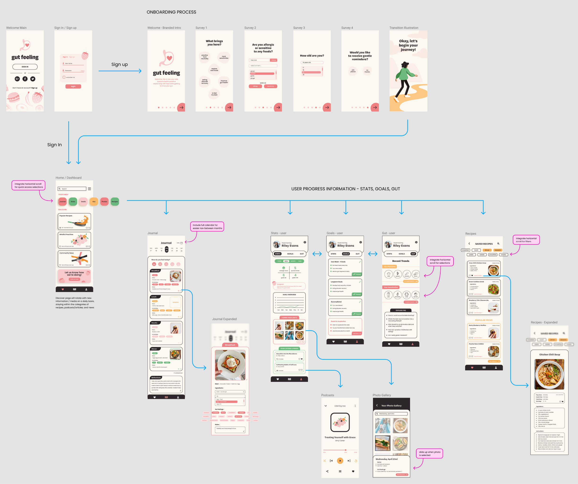
Below is a user flow which allows us to visualize the way a user will be interacting with various components within the architecture of the app. This includes everything from onboarding to journaling, saving recipes, adding goals, etc.
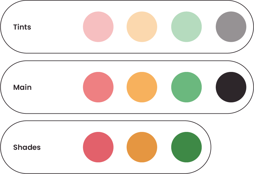
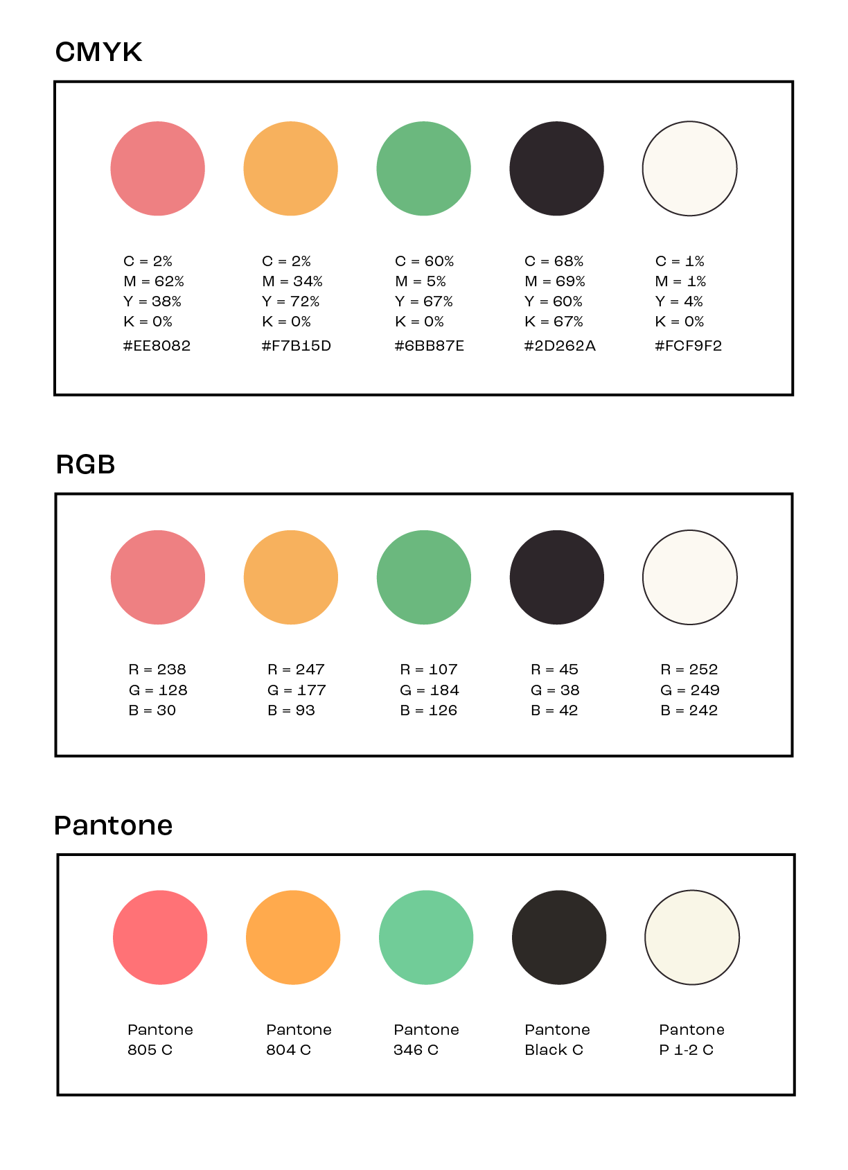
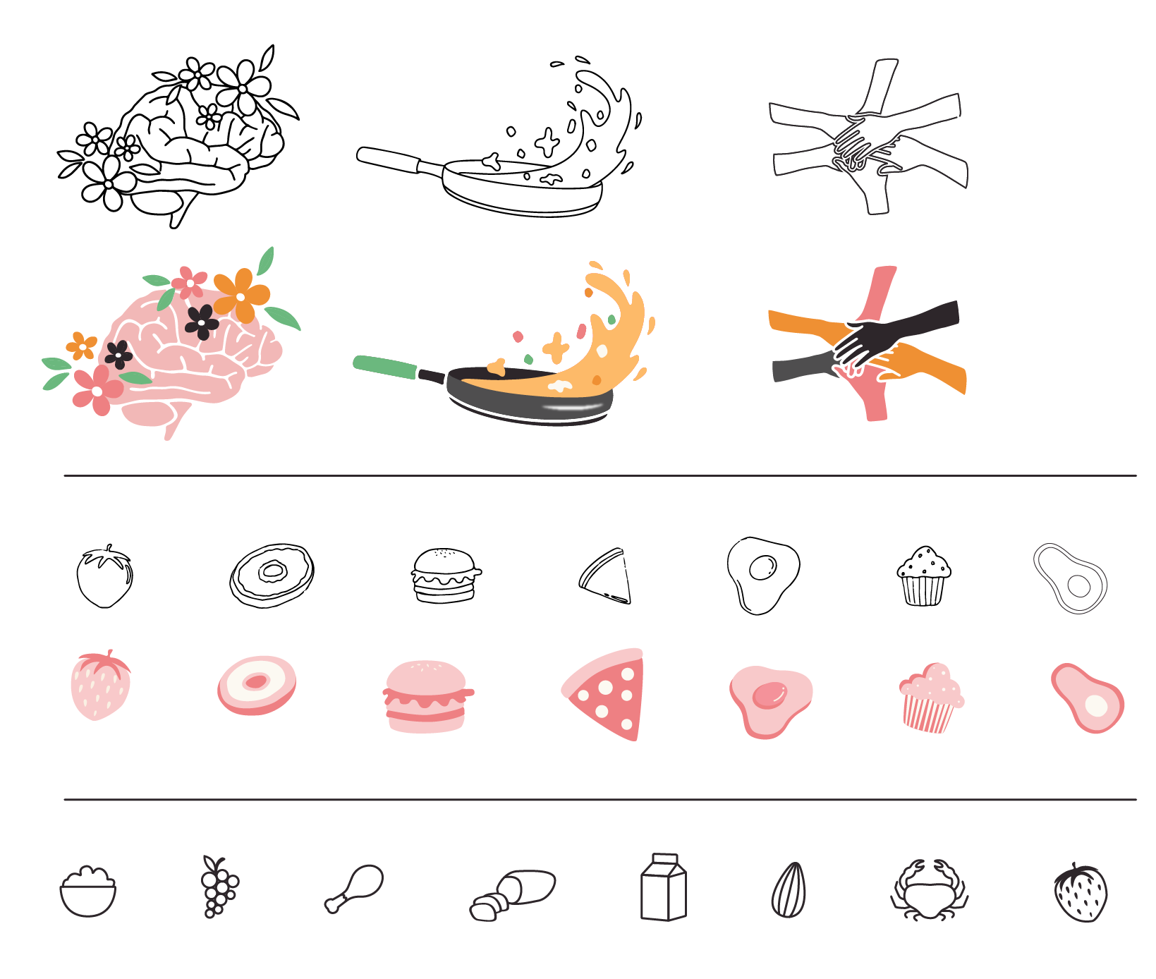
With this app my goal was to create a somewhat minimalist visual system with pops of color and illustrations - it’s fun yet sophisticated and will appeal to young adult women.
Incorporating clean black lines gives a contemporary touch, also evoking a sense of organization and structure within the app
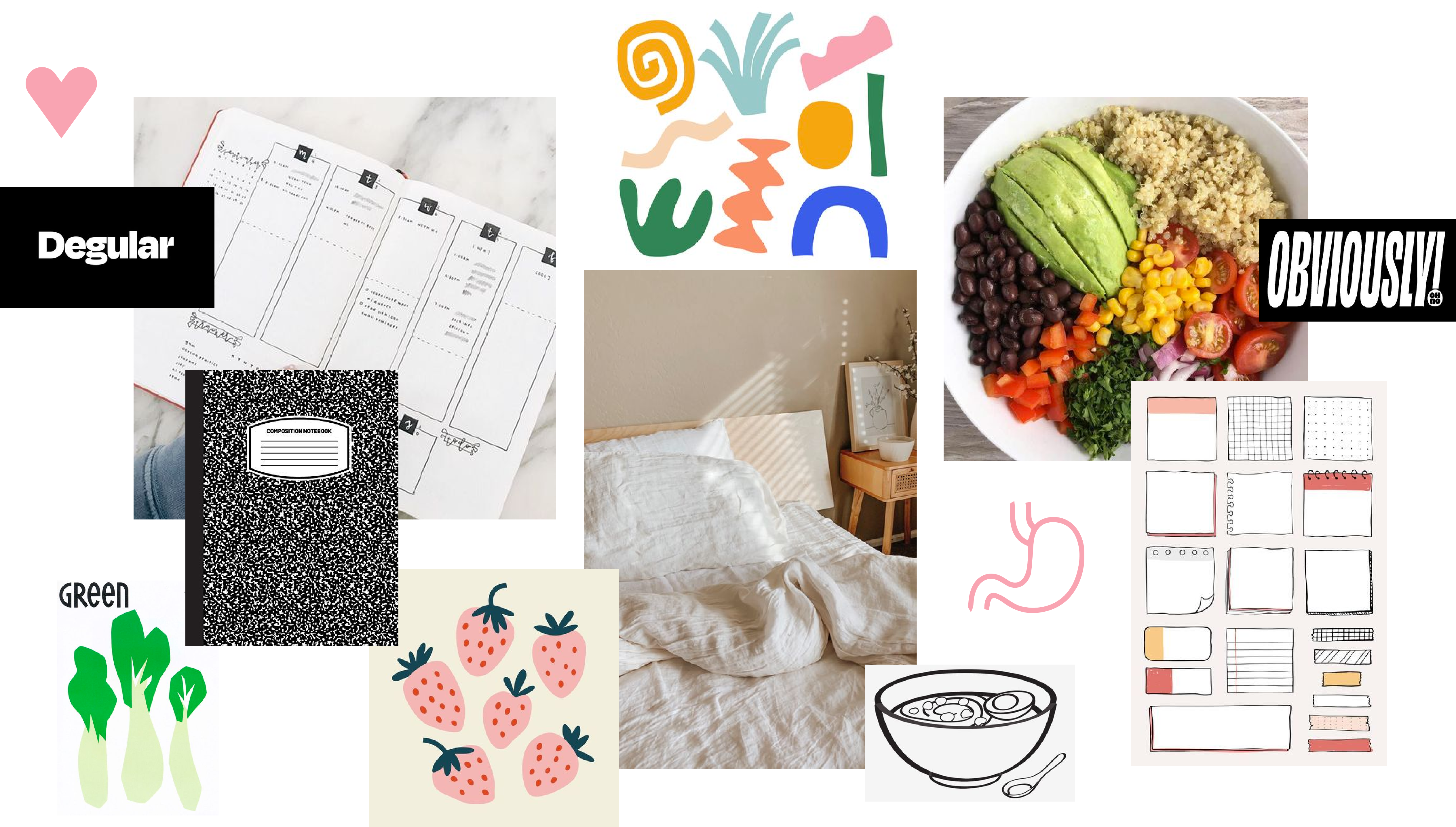
Orange — Playful, friendly, and encouraging.
Pink — Hint of femininity with potential appeal to our ideal user.
Green — Health, balance, and calmness.
Cream — Evokes virtue, peace and simplicity.
Black — Modern touch.
Degular, a modern slab sans-serif with playful higher contrast areas pairs well with a low contrast, rounded typeface such as Poppins - notable as a mobile-friendly type option with seamless scalability across channels and platforms.
Their differences are what allows them to compliment each other so well.

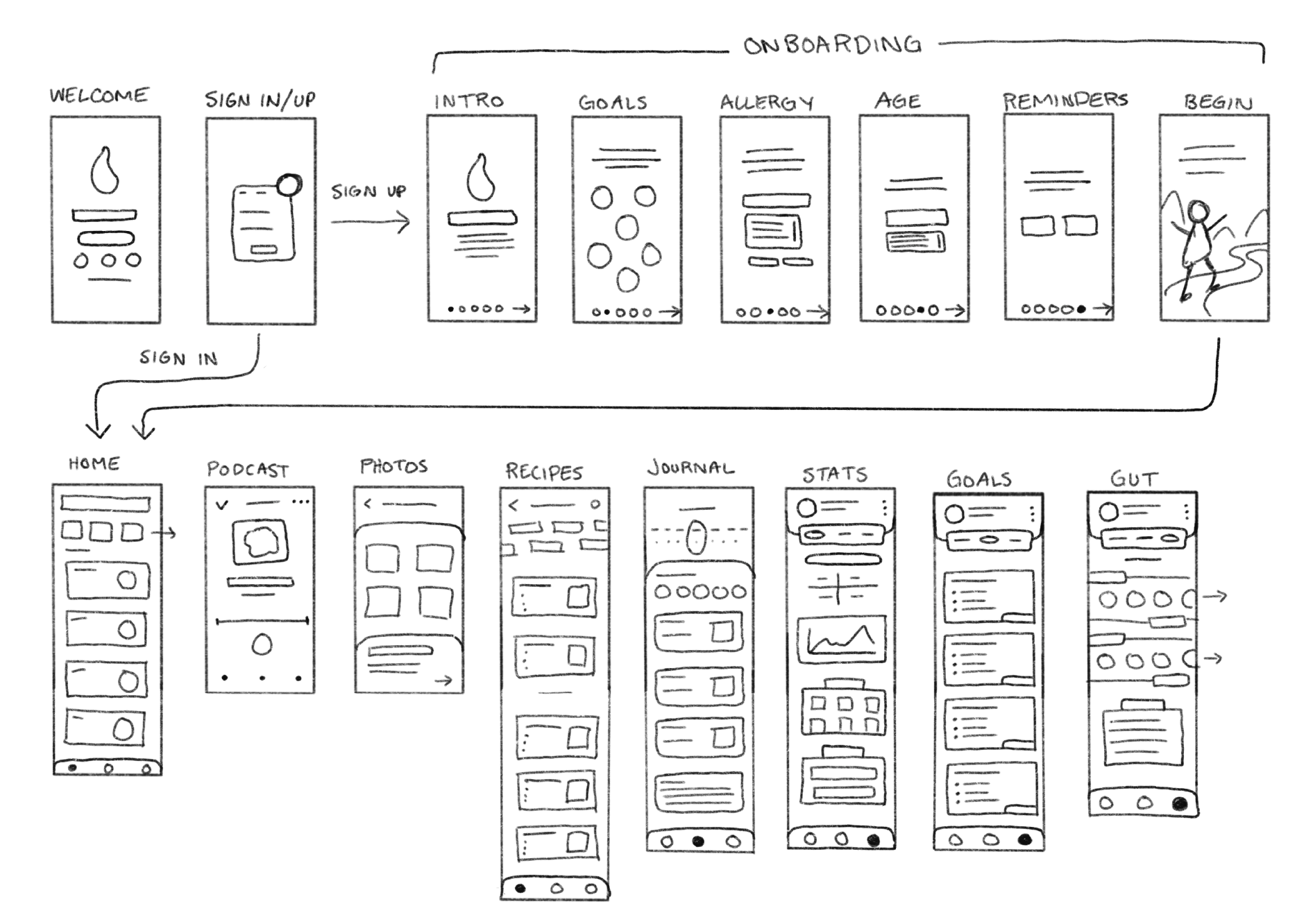
Below includes the process of graphic sketching and refinement. Items which are to be used as logos, icons, backgrounds, etc.
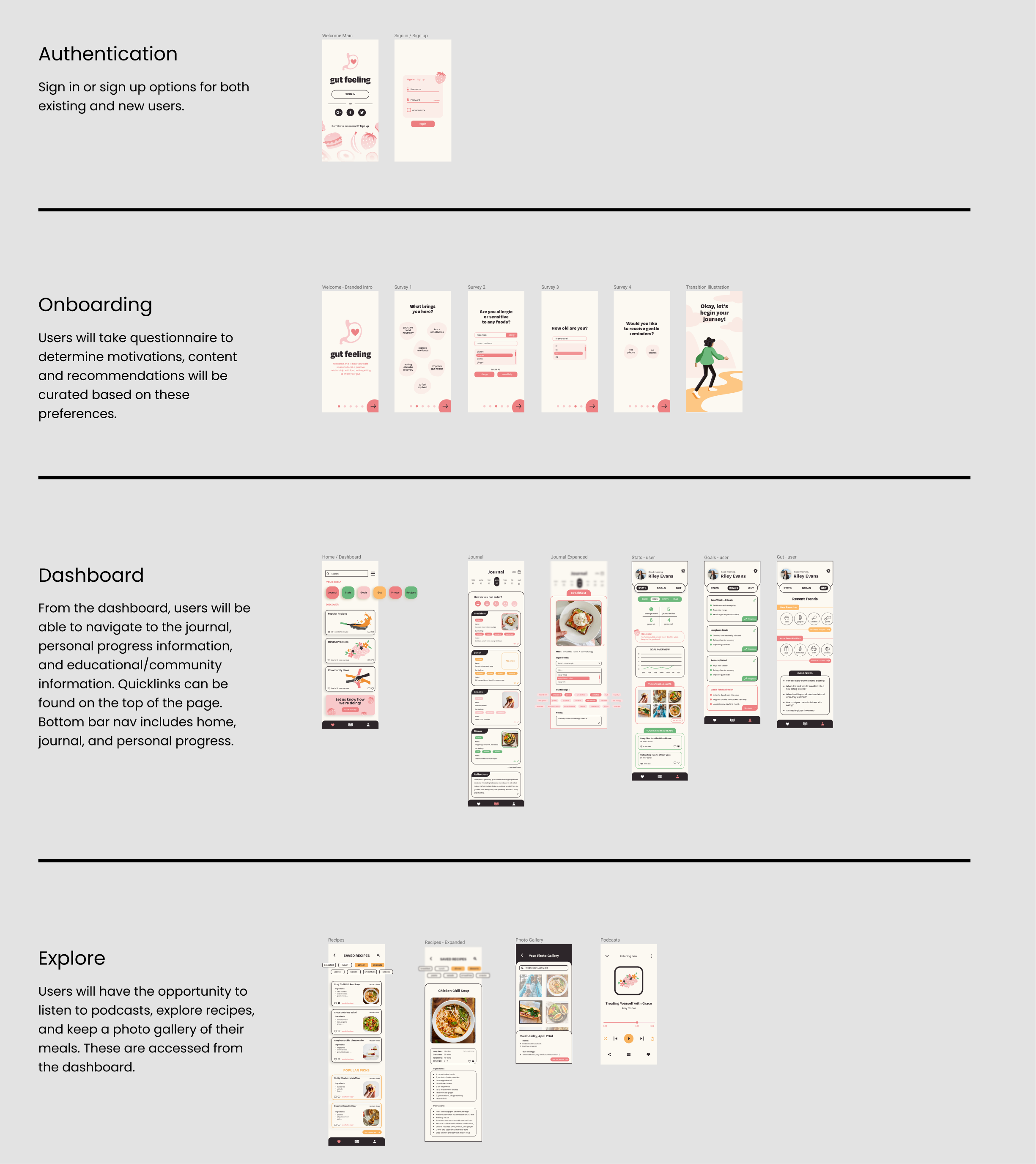
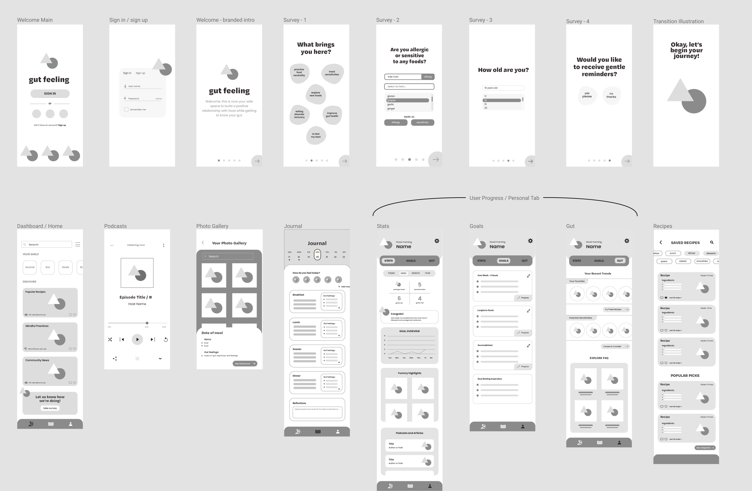
Click image to view all individual screens in the light box below.