


Conceptual Brand & Identity Design - 2021
A candle is the simplest luxury purchase that can be made across all income levels.
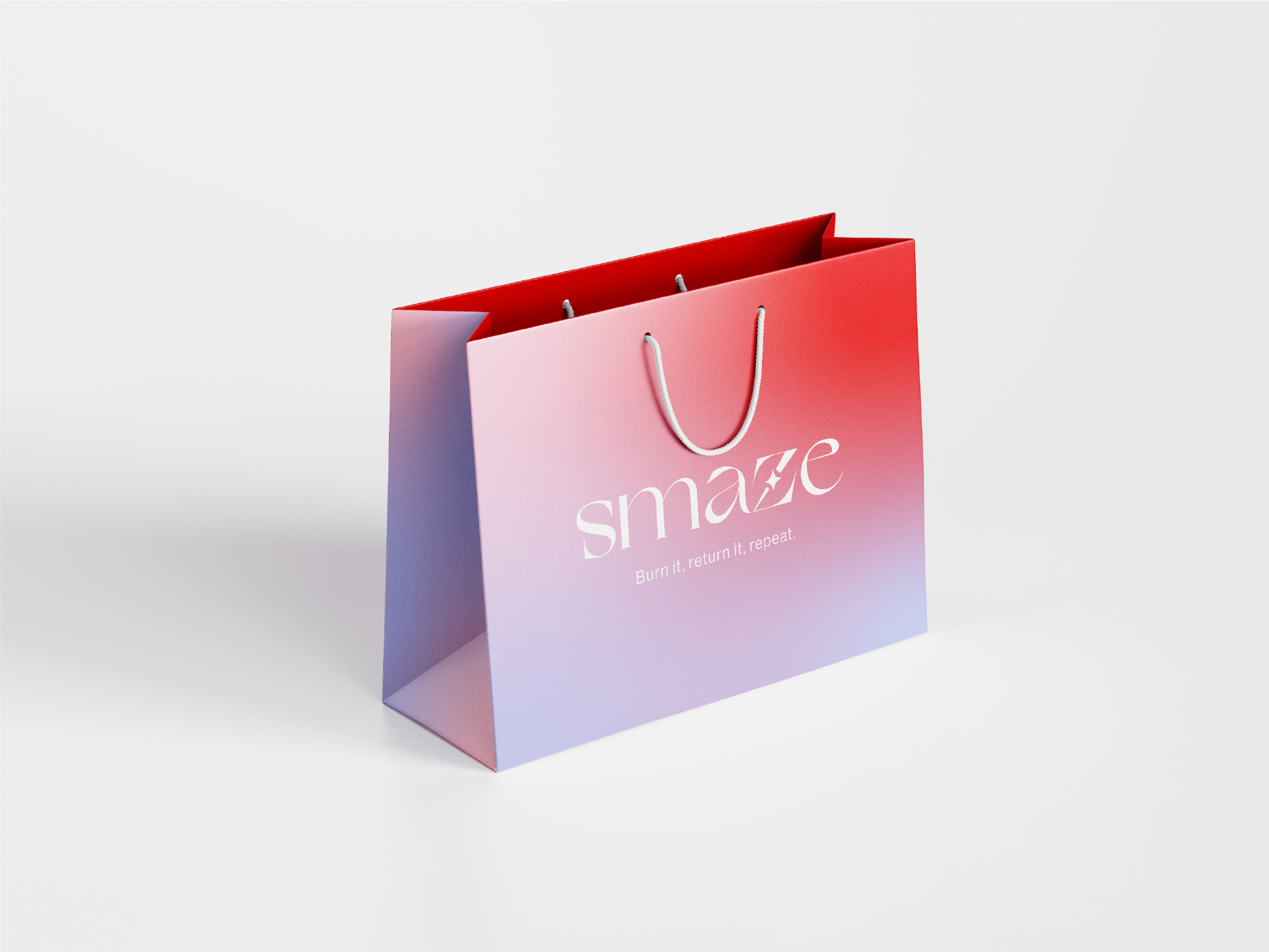
Smaze is a candle brand supporting the zero waste movement in a glamorous way, we believe making sustainable choices is easy when one doesn't have to sacrifice color or style. Customers can purchase a candle, send back the empty container to be re-used, choose their next scent, and continue the cycle.
Out ideal customer is a health and environmentally conscious millennial woman who also values luxury. Many are either working full time or busy with families, so lighting a candle is an easy form of self care within a busy schedule.
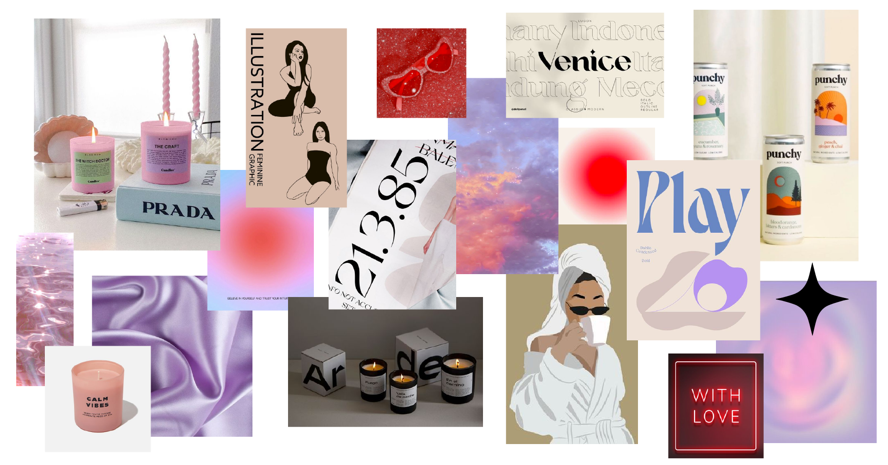
I created a mood board to gather inspiration for how the brand will be represented across touch points.
I aimed to contrast gentle gradients with sharp lettering to evoke senses of relaxation and luxury.
Many sustainable brands have an organic/rustic feeling, but the goal here was to establish a more refined design, appealing to women with taste for high-end products.
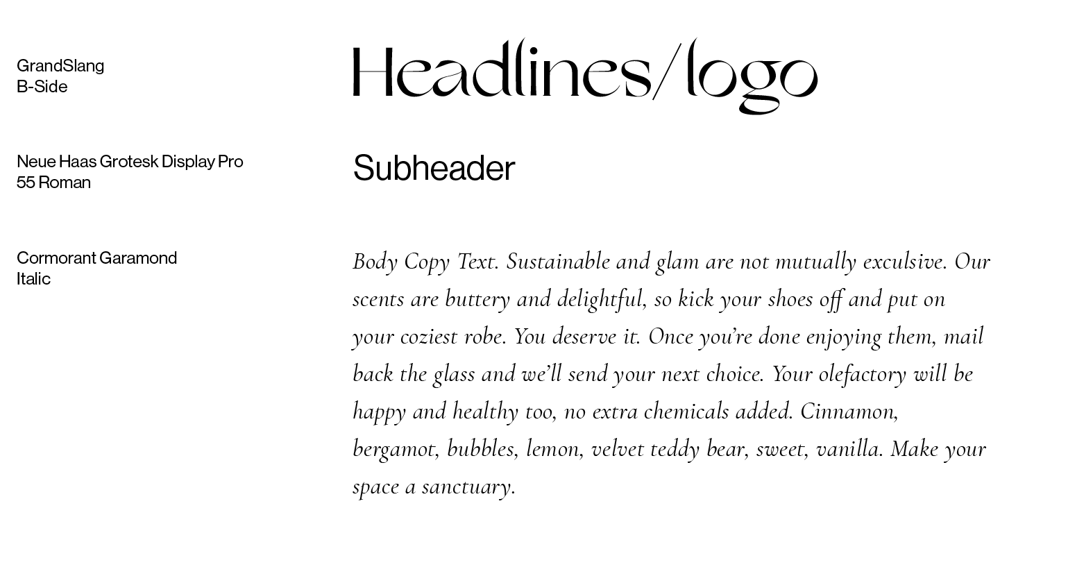
The typefaces I chose were GrandSlang B-side, Neue Haas Grotesque Display Pro in 55 Roman & Bold, and Cormorant Garamond in Italic.
GrandSlang:
A sleek aesthetic, quite similar to fonts used by luxury brands. Eye-catching in nature and ideal for our word mark, headlines, and packaging.
Neue Haas Grotesque:
A versatile san serif; its clean lines, scalability, and legible style contrast nicely with the unique headline type.
Cormorant Garamond in italic:
Its fluid letterforms resemble those found in GrandSlang, also ideal for small, detailed product descriptions.
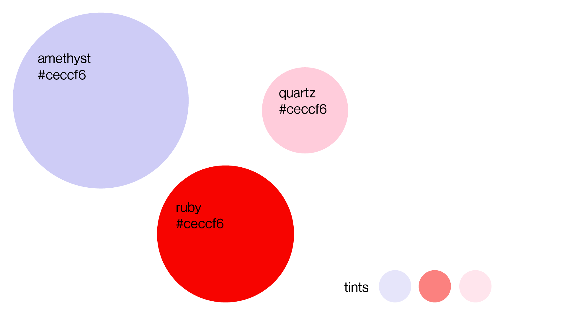
These colors define the feeling and tone of the brand across touch points.
An analogous trio inspired by the colors in a sunset - widely seen as calming and centering.
Violet: Evokes a sense of relaxation and calmness.
Pink: Contributes a feminine, soft touch, ideal for our target audience.
Red: Often representing luxury, it's eye-catching and contrasts well with the softer pink and violet.
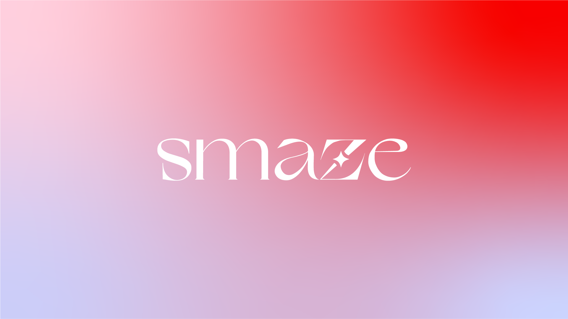
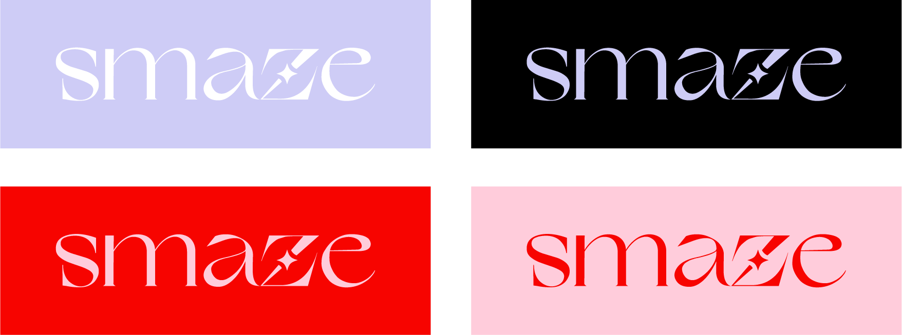
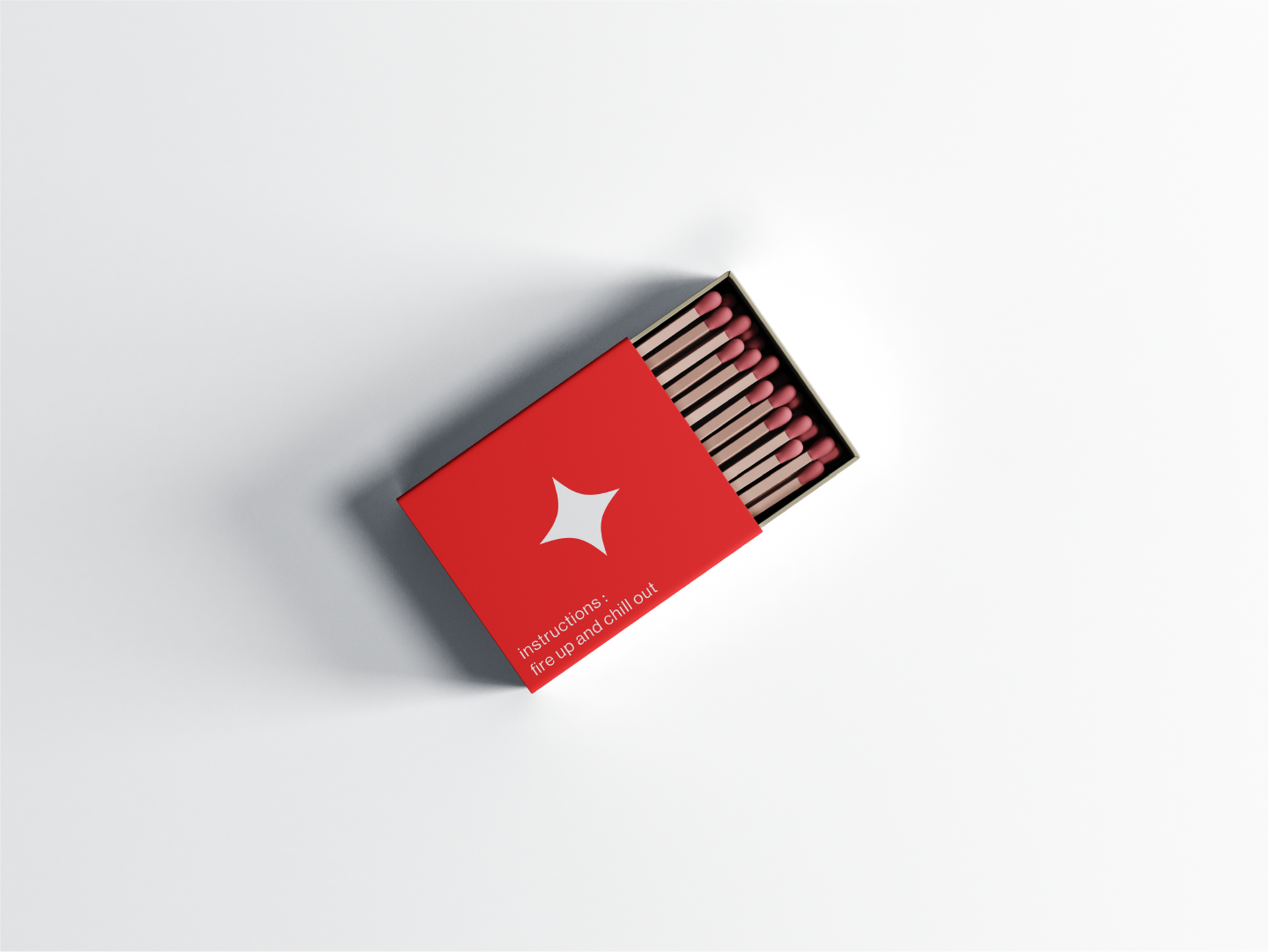
The word "smaze" means haze, alluding to the feelings of tranquility and slowness a lit candle can bring.
To contrast with the soft gradients used across this visual identity, I chose to design the word mark using the sharp, Grand Slang B-side typeface.
A small star icon is positioned through the center of the diagonal stroke of the letter 'Z' as a reference to a light/flame.
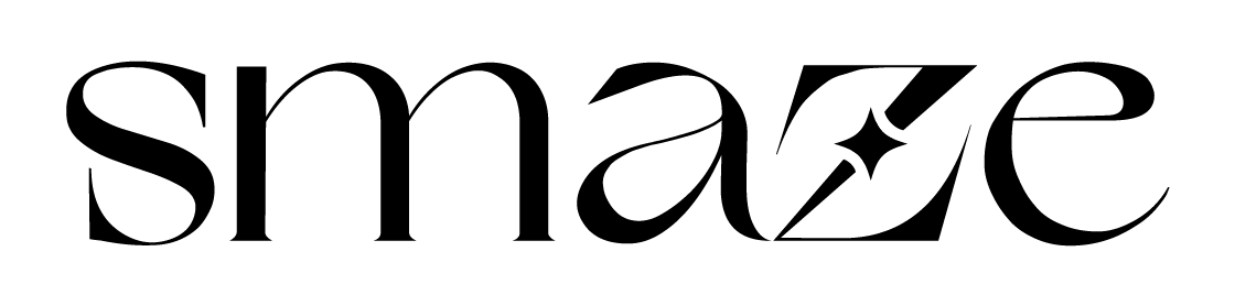
The Z is constructed by setting star's position, expanding its appearance, duplicating with an offset path (represented in dotted lines), and using the shape builder to remove the area between the two stars and Z (represented in red).
This method ensures clean edges and increased visibility with ample breathing space between the letter and icon. Slight anchor adjustments for refinement and it's complete.

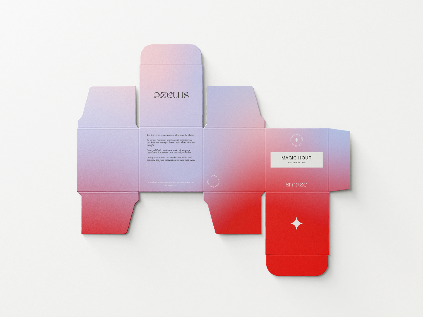
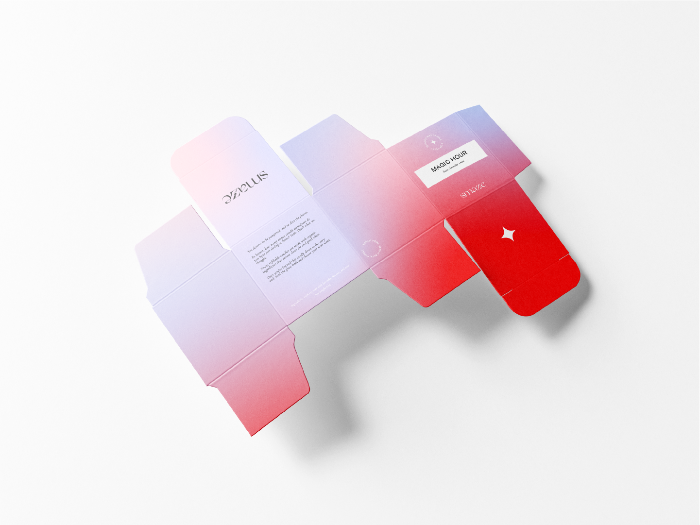
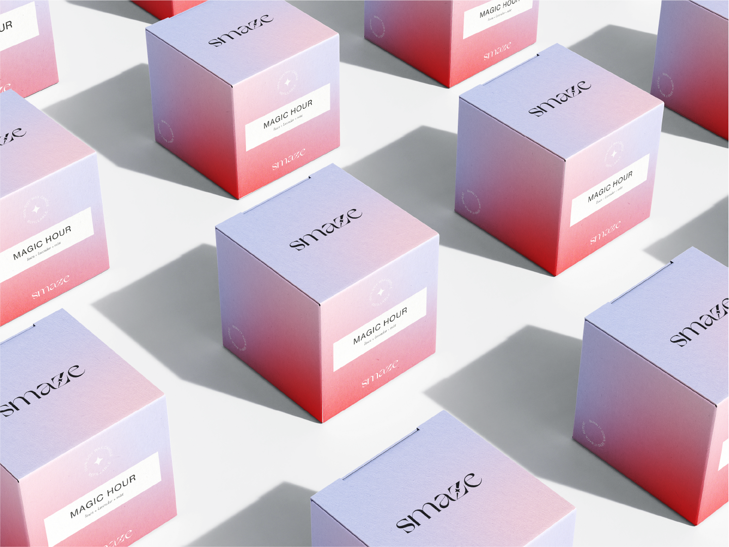
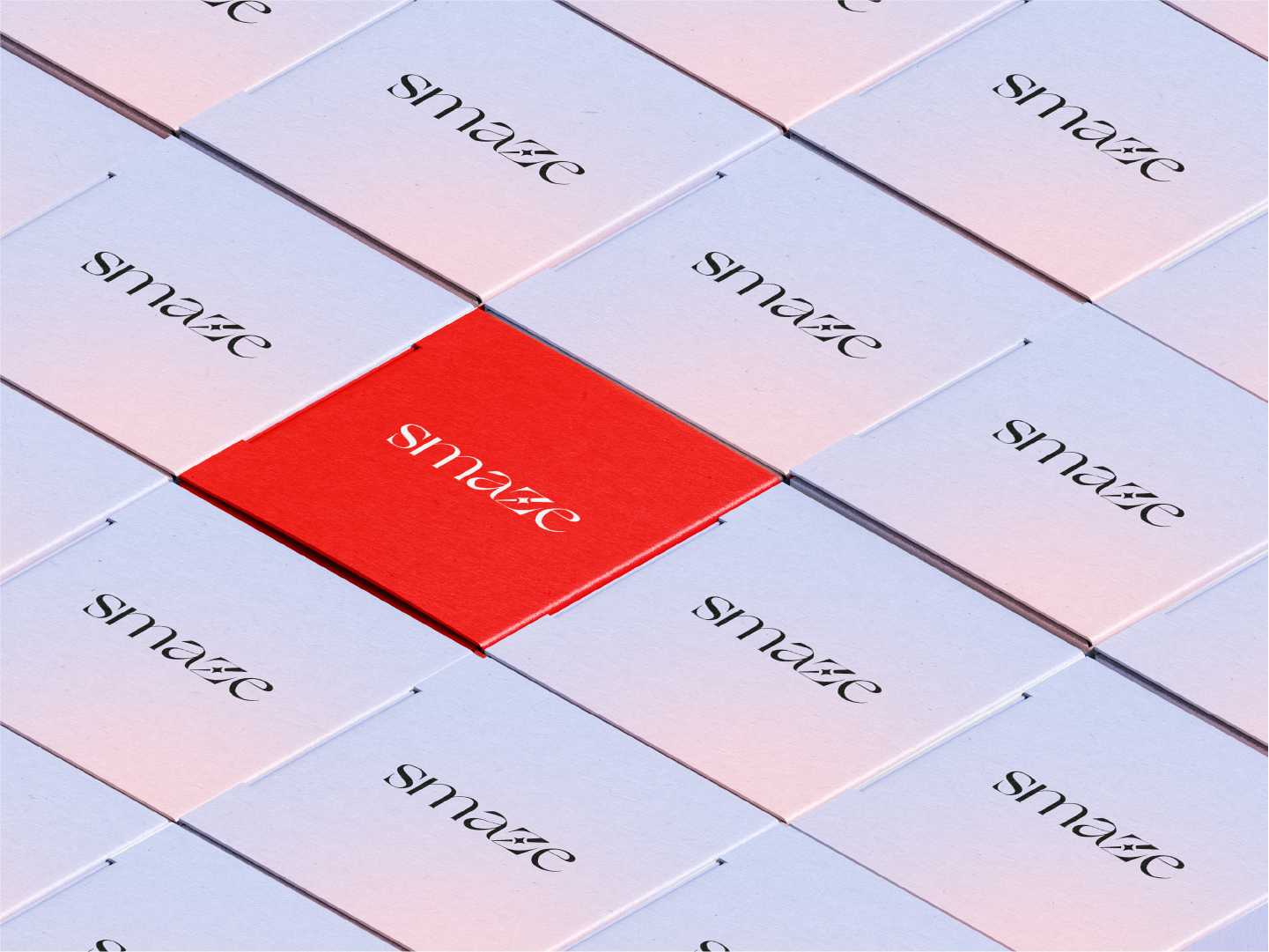
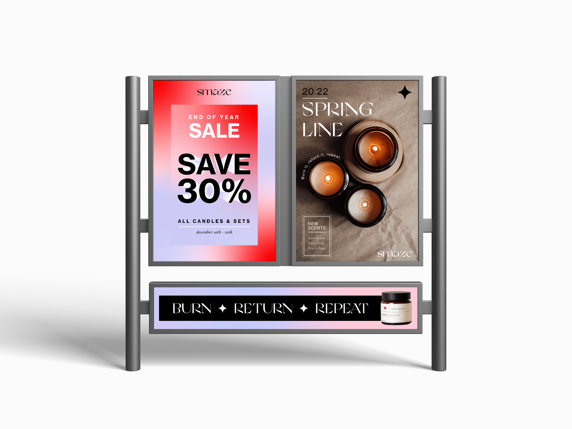
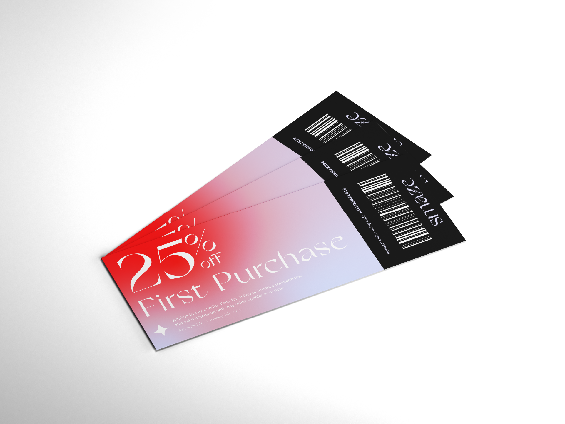
Background and type color palette combinations show the variety possible while maintaining consistency.
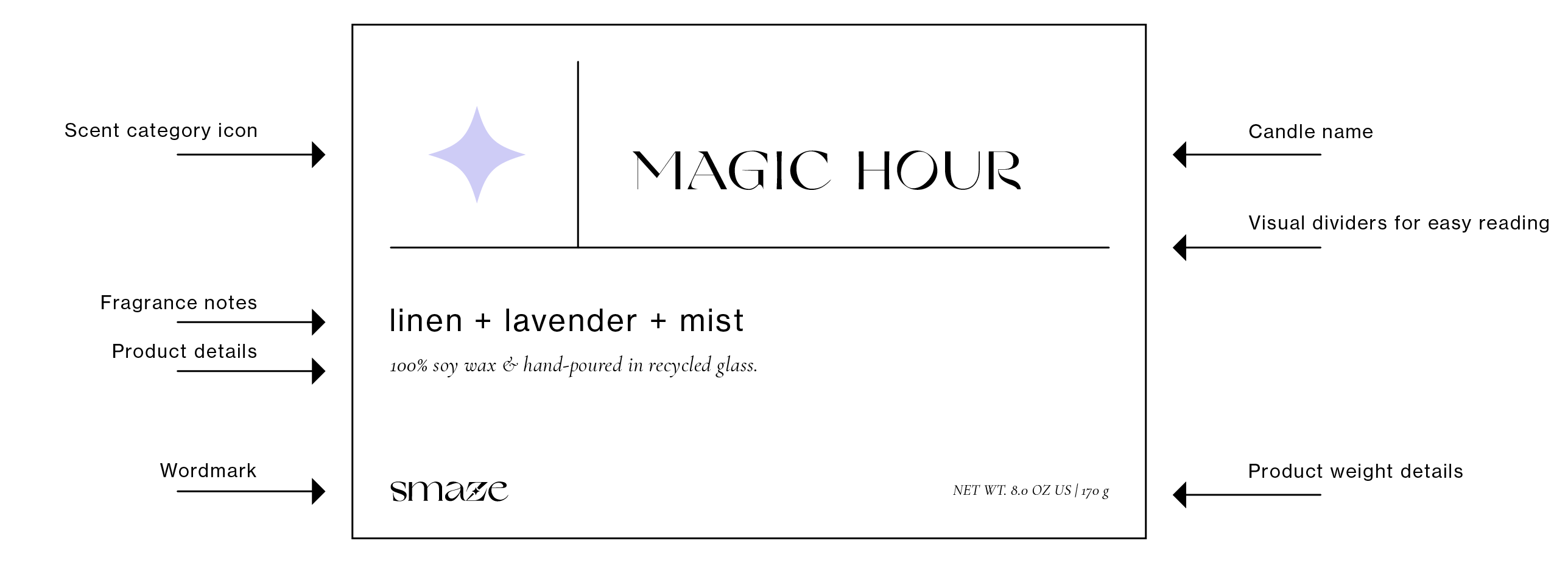
Visual dividers establish separation for easy scanning of product information.
Hierarchy of typography is applied to distinguish product name, description, and more detailed ingredient information.
Star icon logo color depending on the scent profile - fresh, floral, warm, etc.
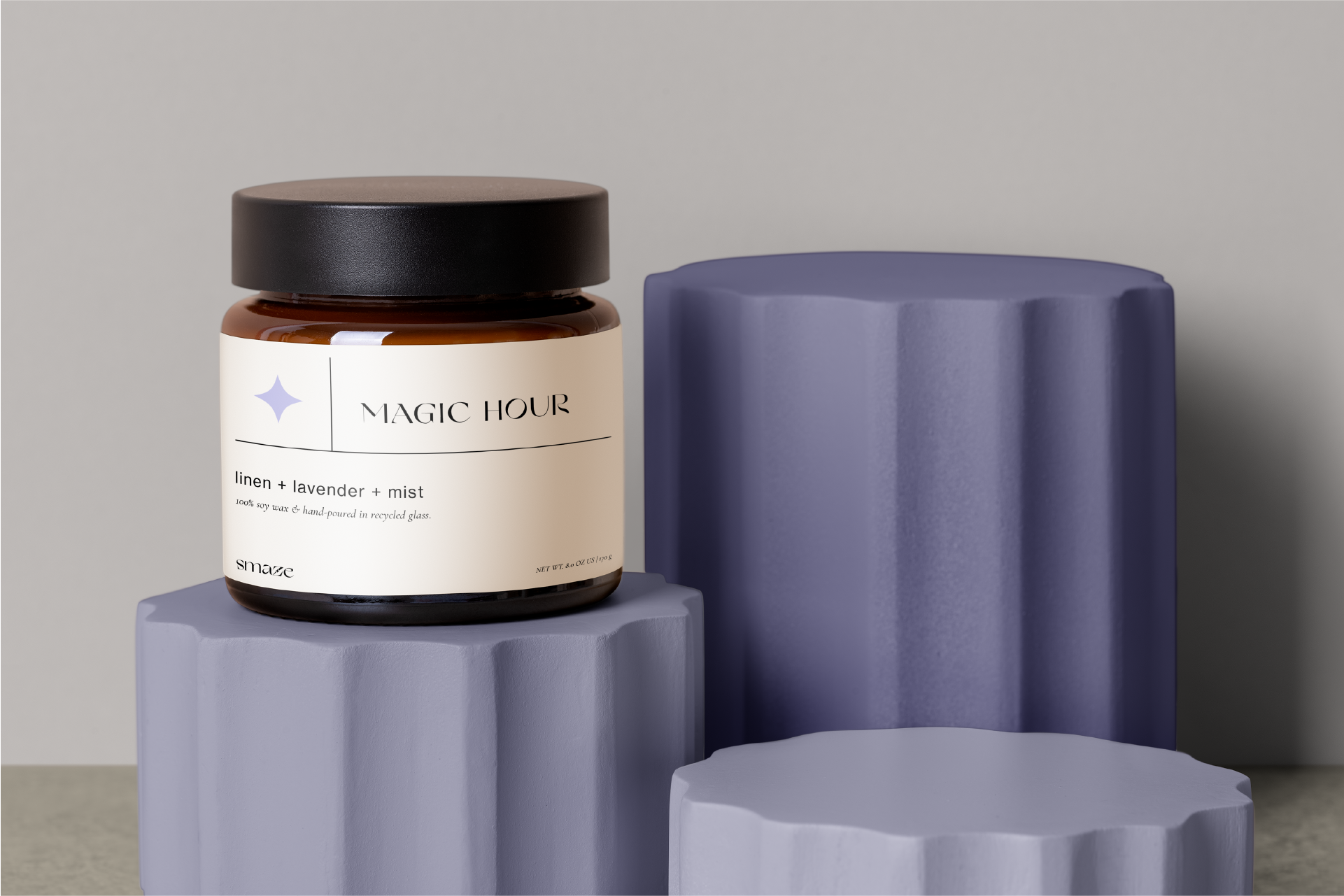
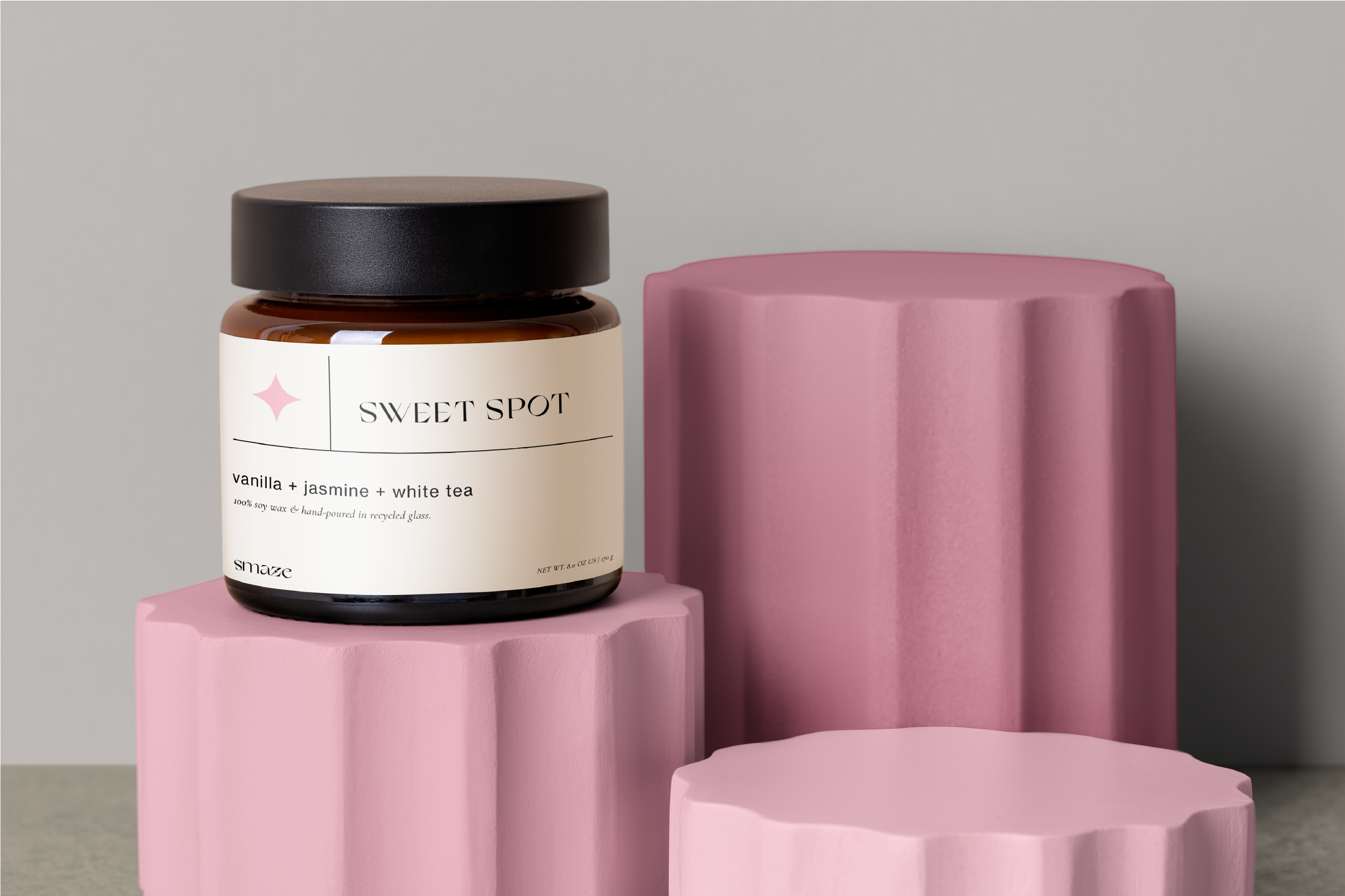
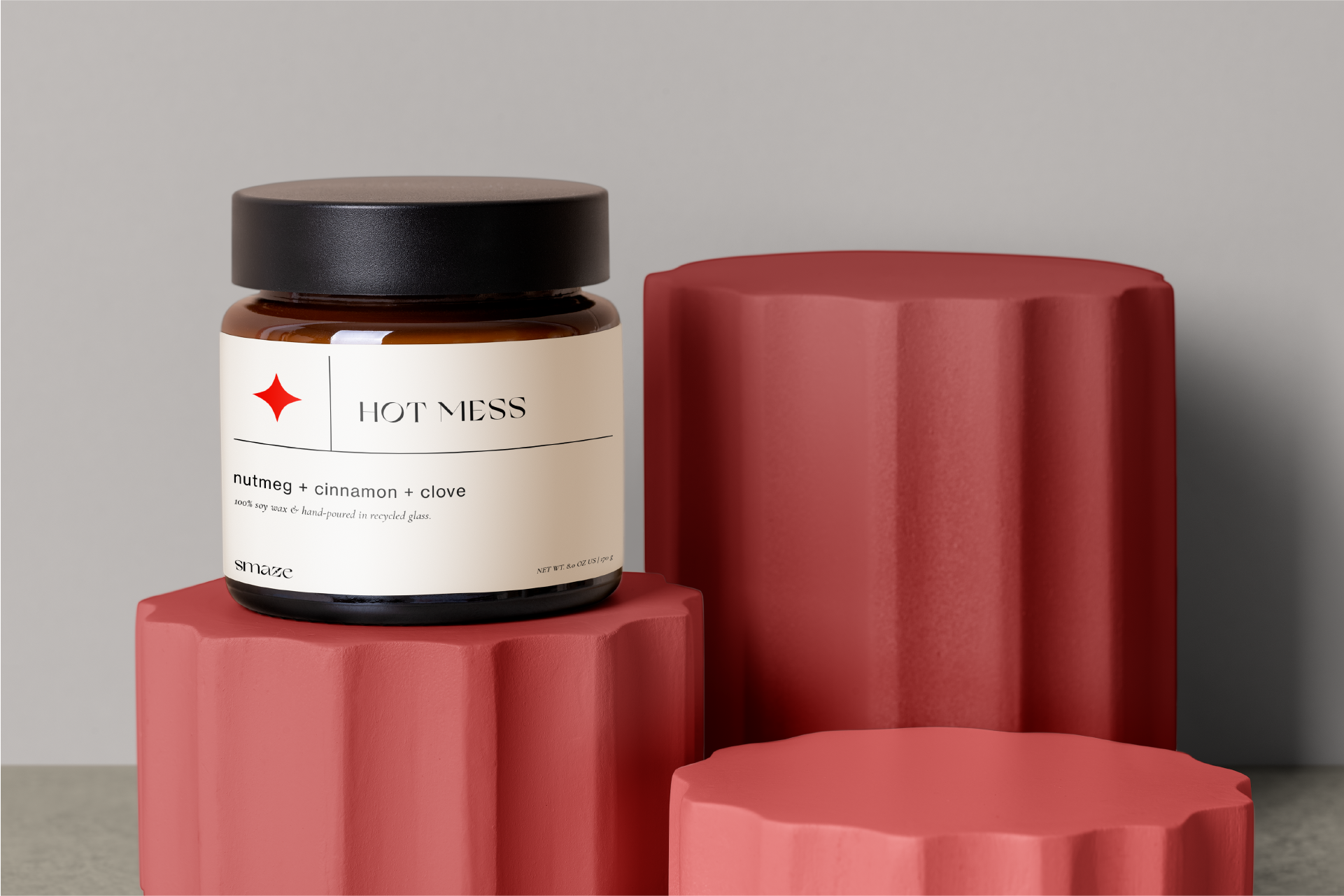
All-over gradient creates visual fluidity on packaging.
The progressive movement of color encourages the customer to look at the entire packaging, bringing the eye from the front to the back where detailed product information is located.
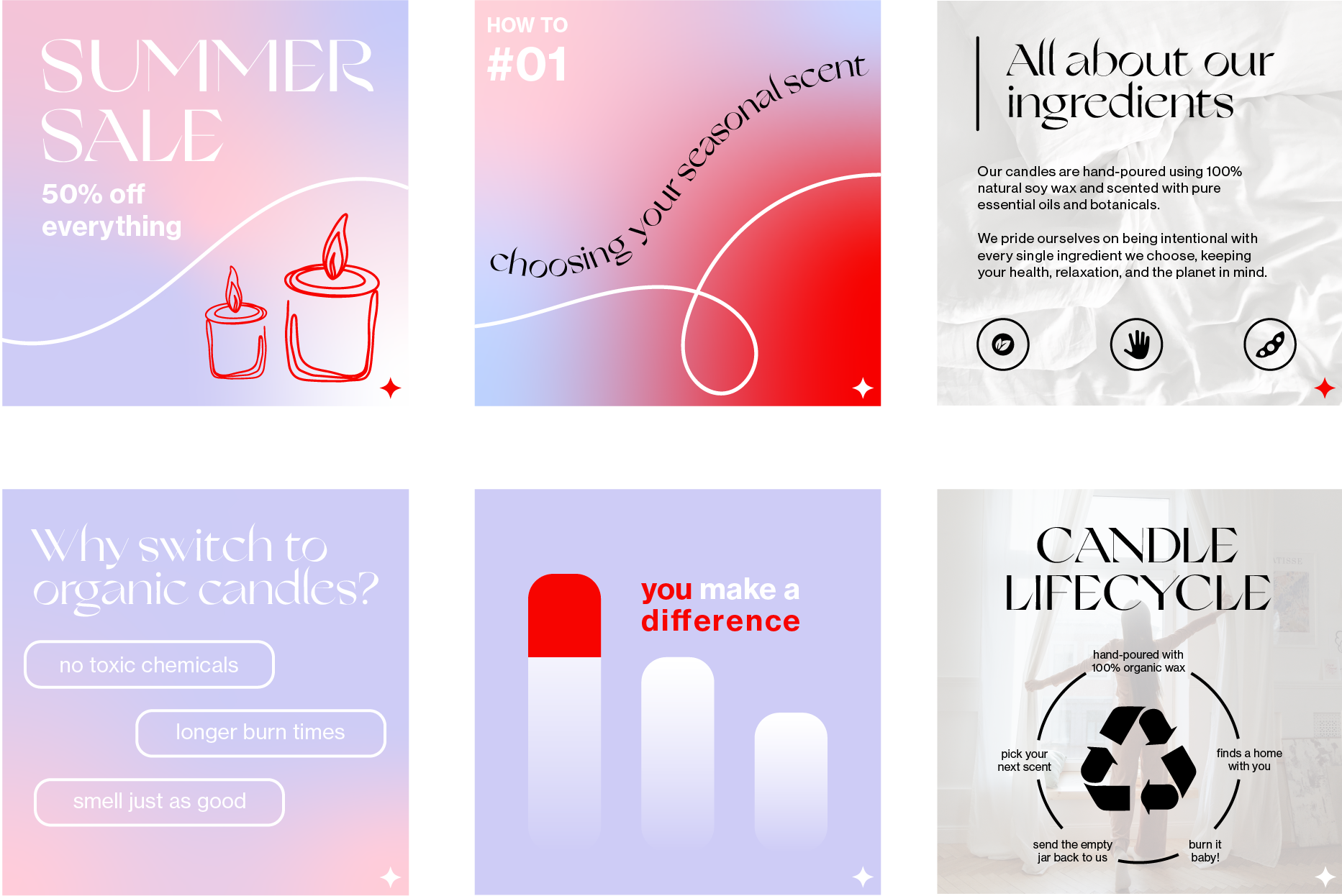
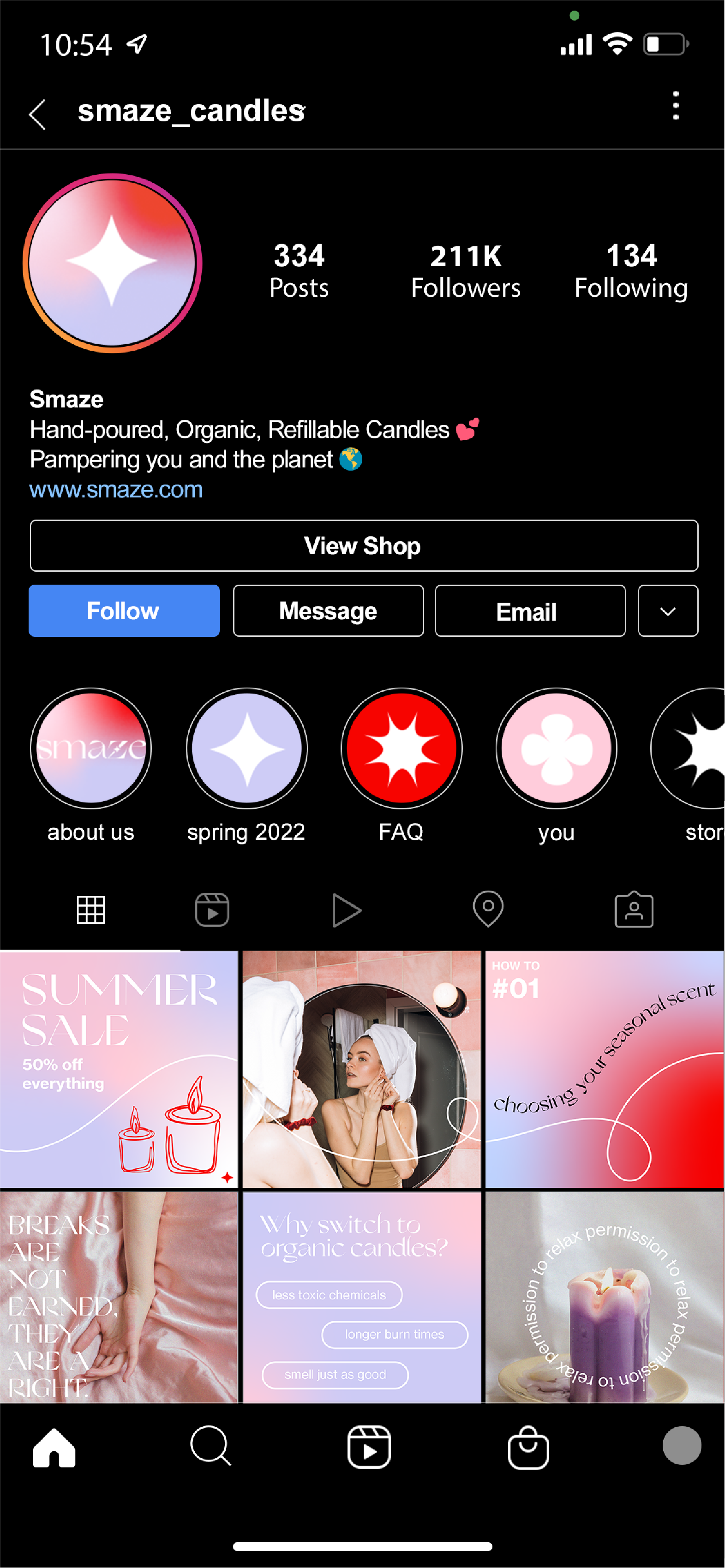
The instagram account includes an alternation between infographic/informational posts and photos our audience can resonate with. This creates balance and visual interest for audiences.
Line illustrations have a sense of playfulness and elements which flow between posts guide the eye to information.
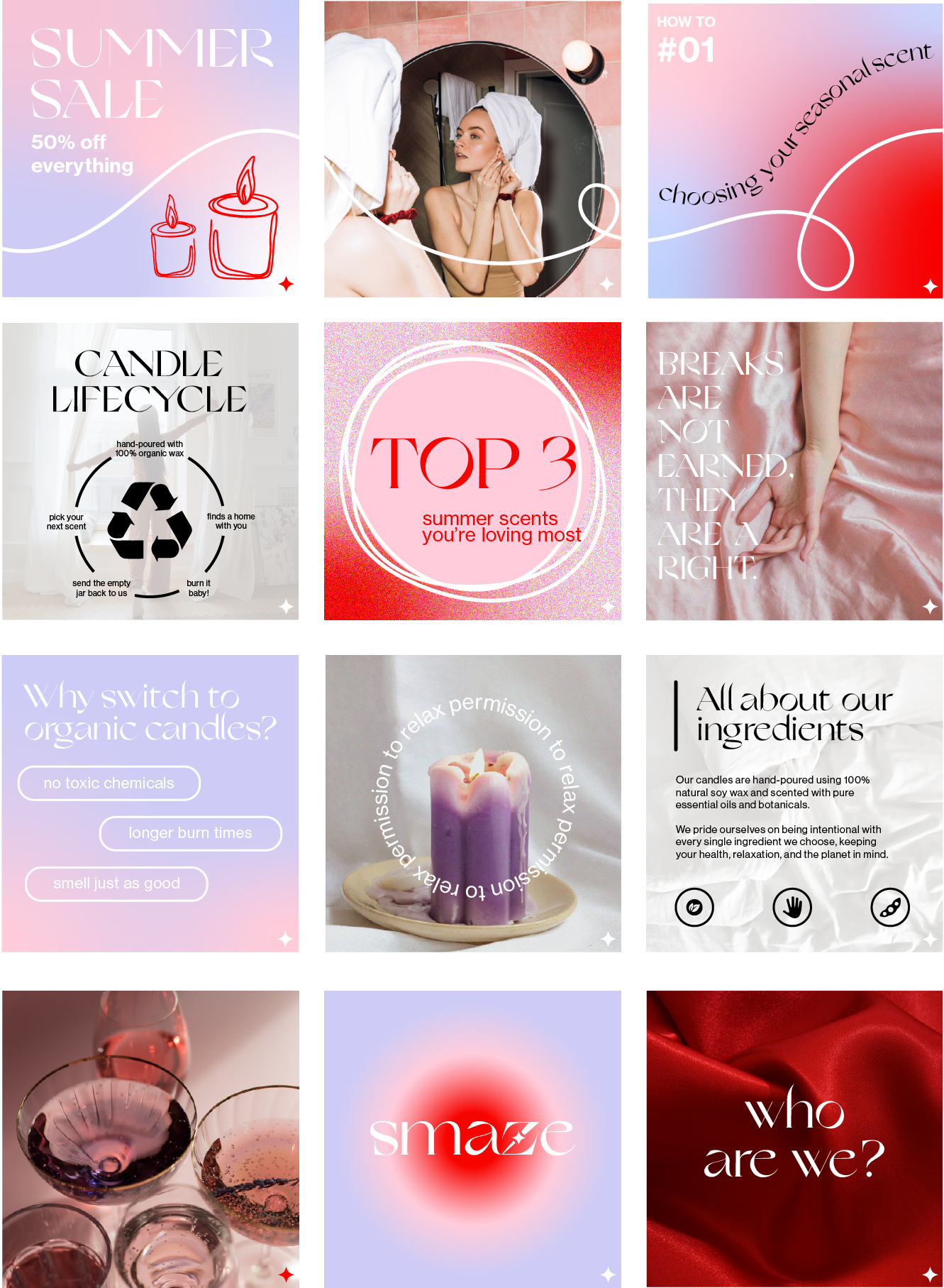
Informational content is important in spreading brand messaging around sustainability goals. Posts also aim incorporate educational material, affirmations, storytelling, promotional content, etc.
Many of these posts feature gradient or low-opacity neutral images as background, utilizing white and black lettering.
The small icon logo is present in the corner of each post for subtle brand visibility.