Brand & Identity Design - 2021
Vagablonde is a creative brand that allows customers to experience the timeless beauty of memories and nature through art in the form of stickers, apparel, prints, or tattoos.
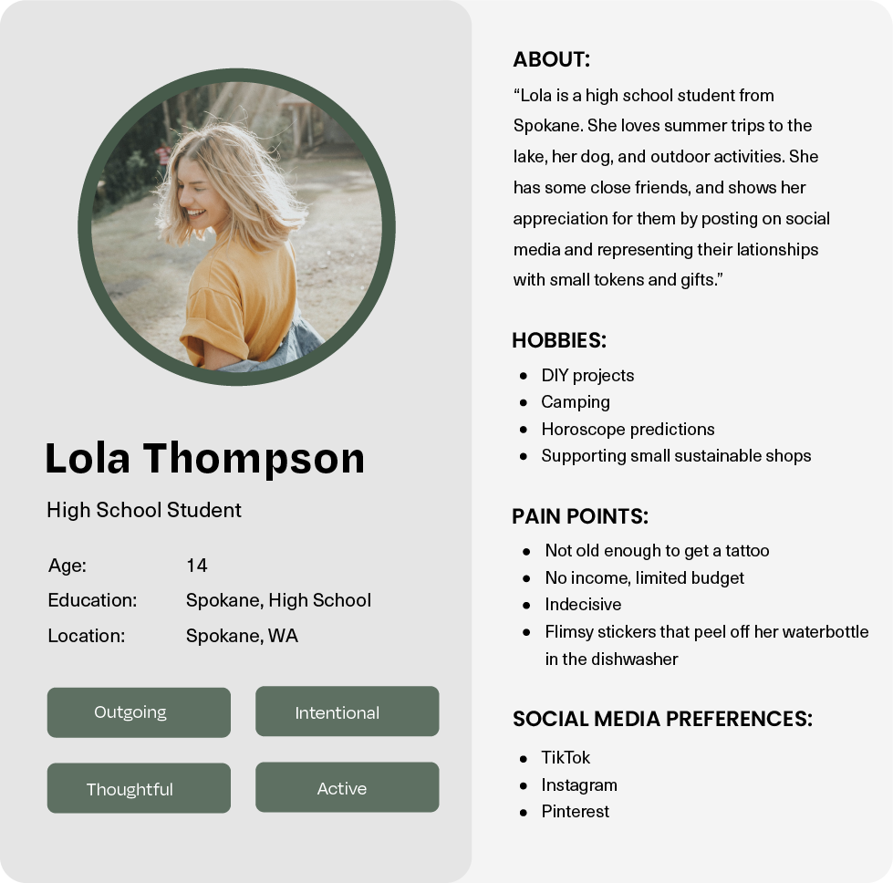
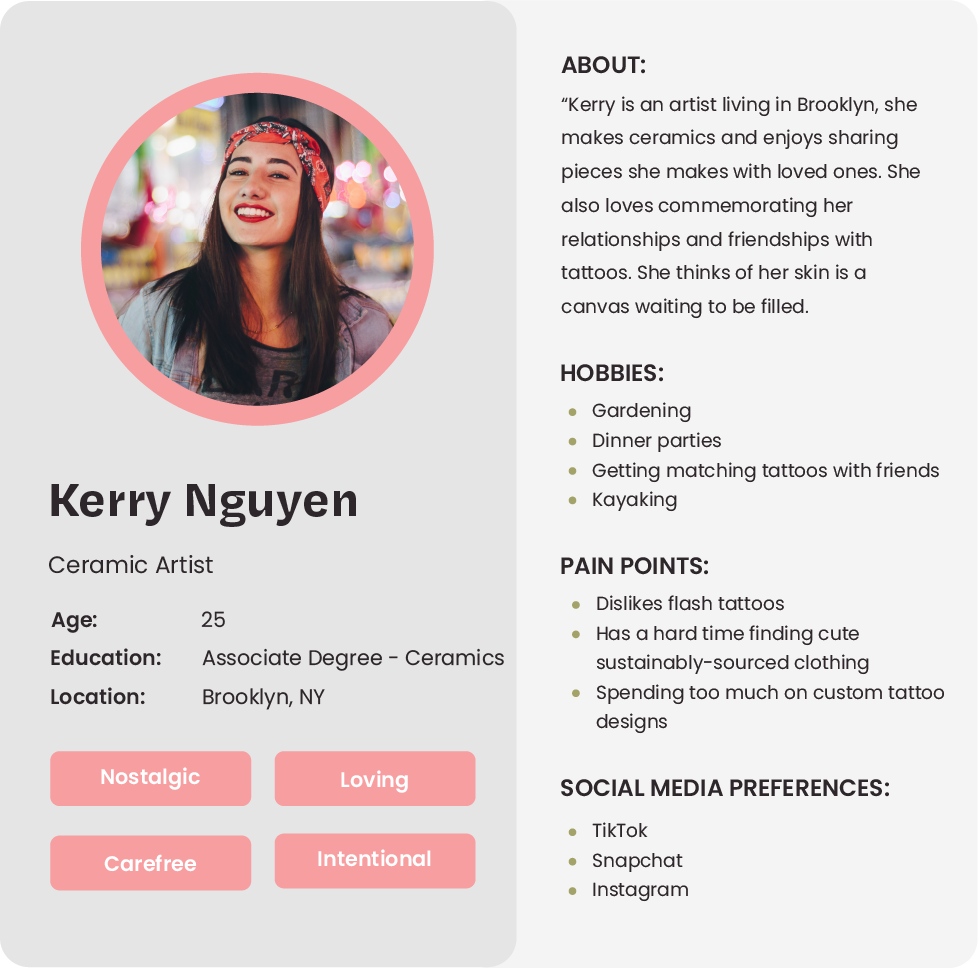
Ideally women between the ages of 13-30. Individuals who are interested in tattoos, art, and adventure.
Based on demographic research and information collected directly from my audience online, I concluded that my ideal user was a female between the ages of 13-30.
Also via comments, popular purchases and conversations, this audience is also sentimental; they gravitate towards expressing themselves and commemorating relationships through art, whether that be in the form of tattoos or non-permanent art.
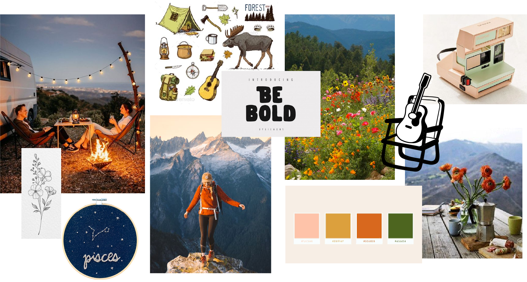
This mood board inspires the visual components of this design system. I wanted the brand to be bold, earthy, and playful; characteristics which reflect the values of the brand, style of the art, and needs of the customer.
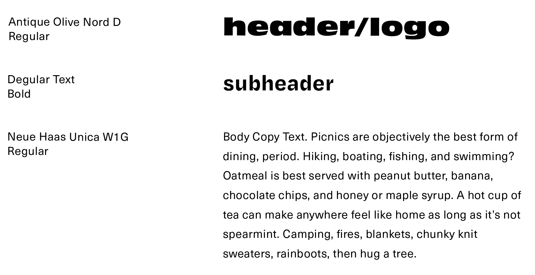
I try to choose typefaces that scale well across platforms while also matching the personality and values of the brand.
Antique Olive: A thick sans serif with slight contrast in the letterforms for a playful nature. All lower-caps gives a friendly and approachable nature.
Degular Text: This grotesque felt like the perfect sub-header as compliment to the the letterforms of Antique Olive. The exaggerated ink traps and high contrast strokes gives a nod to the letterforms of our header - quirky while maintaining legibility.
Neue Haas Unica: My choice for body copy font, it has a simple and clean feel which is ideal for product descriptions and smaller blocks of text.
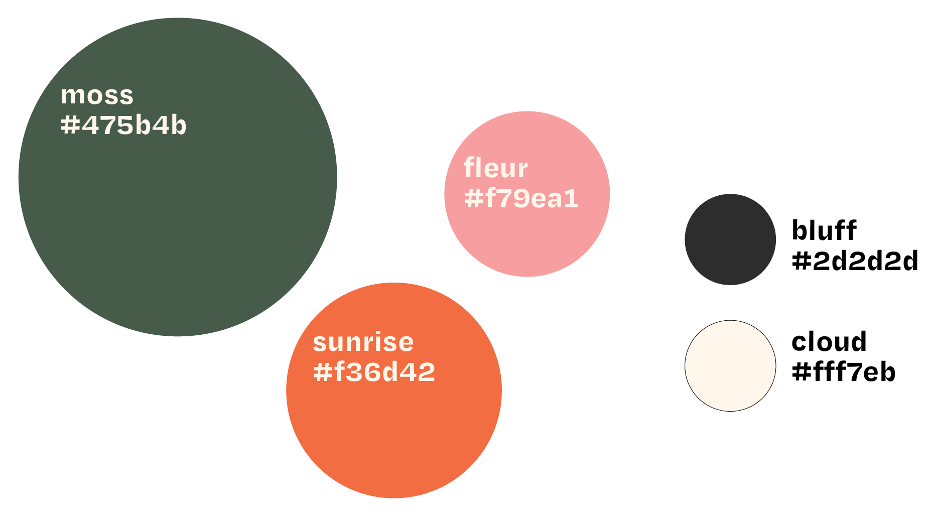
I was intentional with my color choices, creating a split complimentary palette of vibrant earthy tones.
Green: A dark forest green to represent nature, balance, and serenity.
Orange: Evokes energy and playfulness, a color to inspire adventure.
Pink: A feminine touch to appeal to my ideal customer and balance the orange and green
Off-white/black: These are more gentle on the eye than pure white/black.
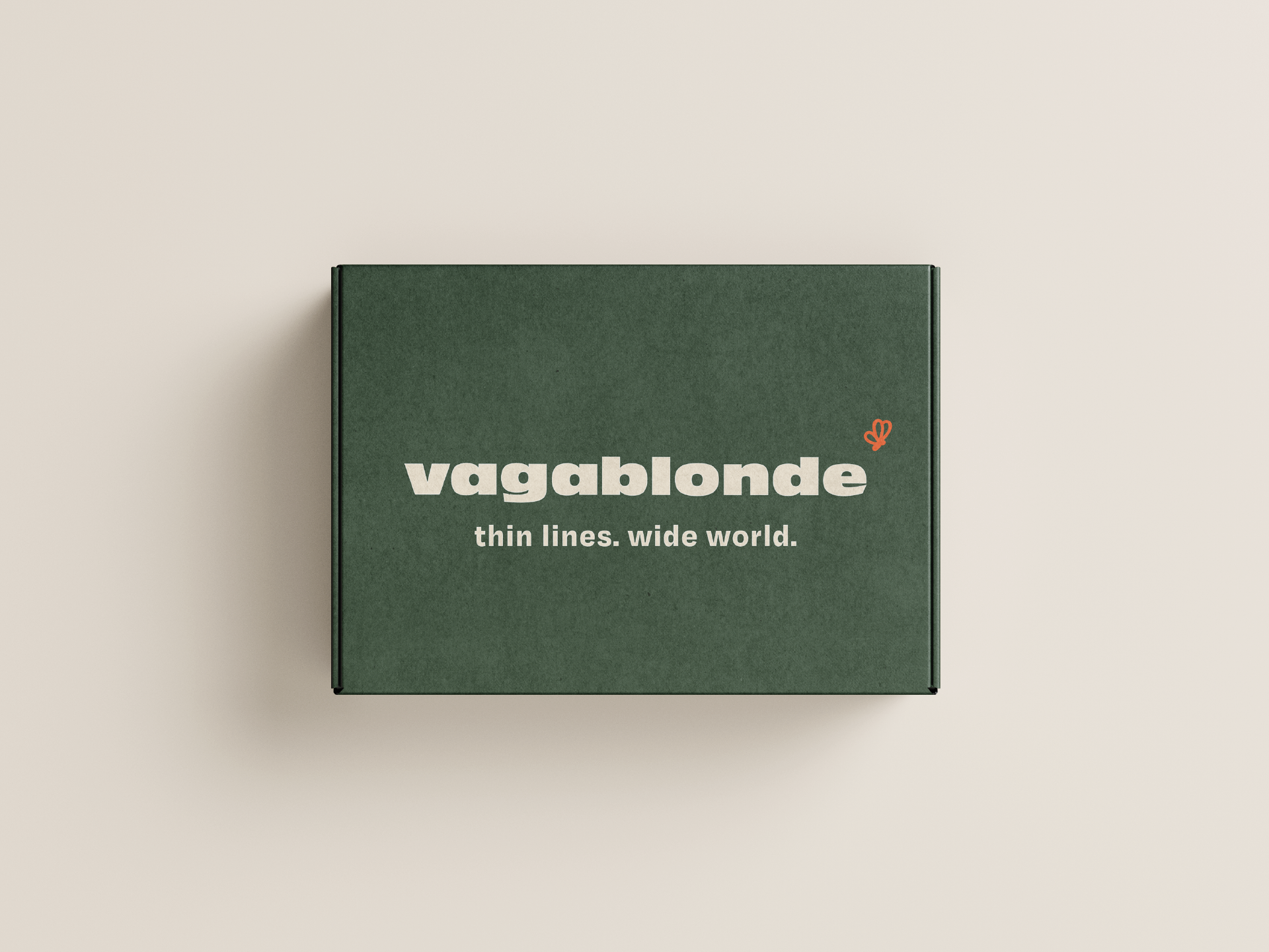
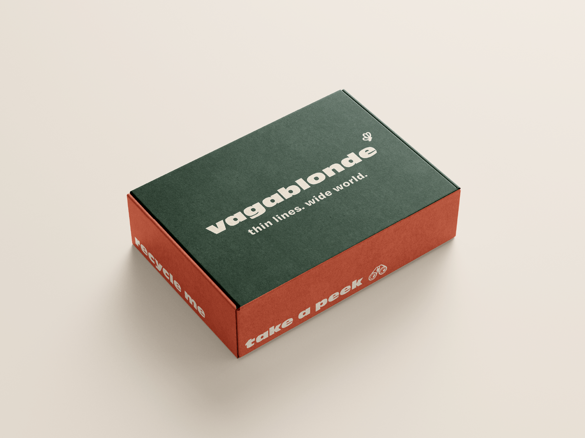
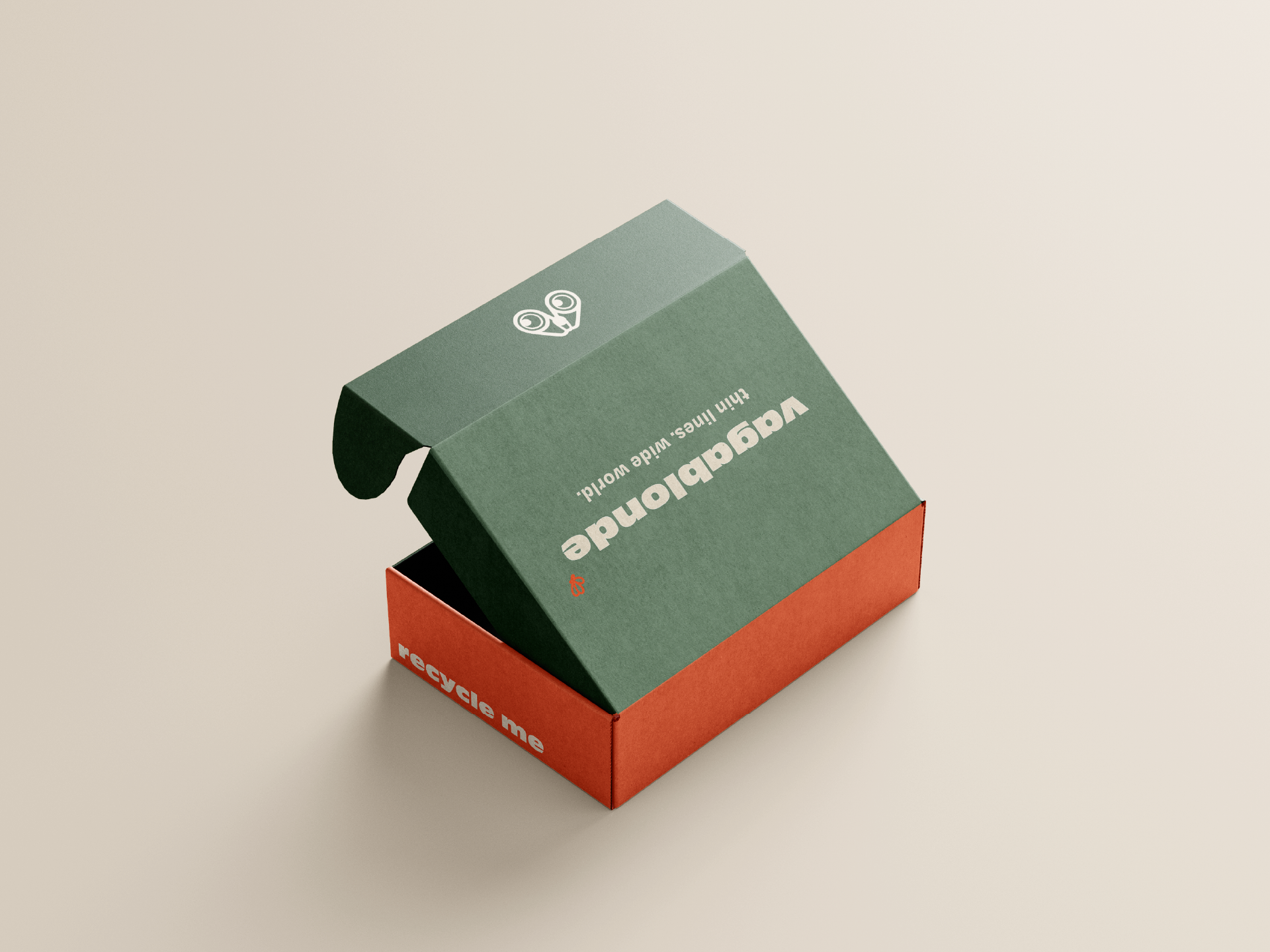
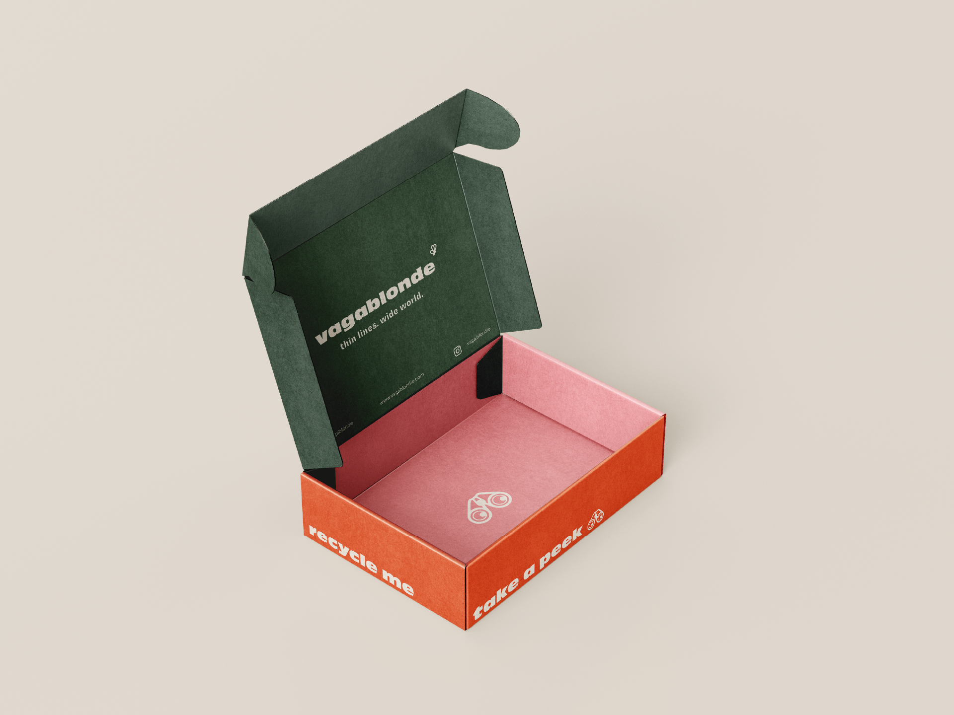
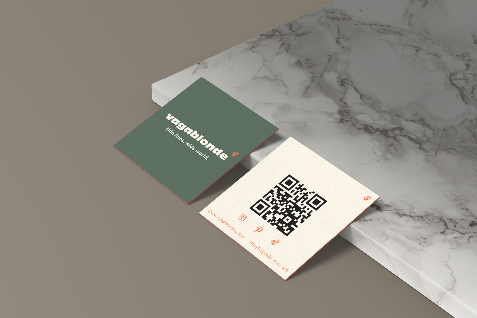
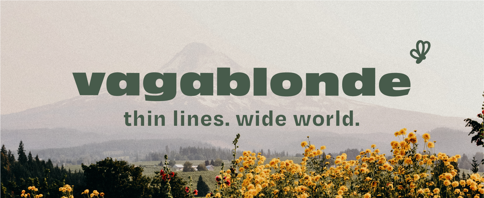
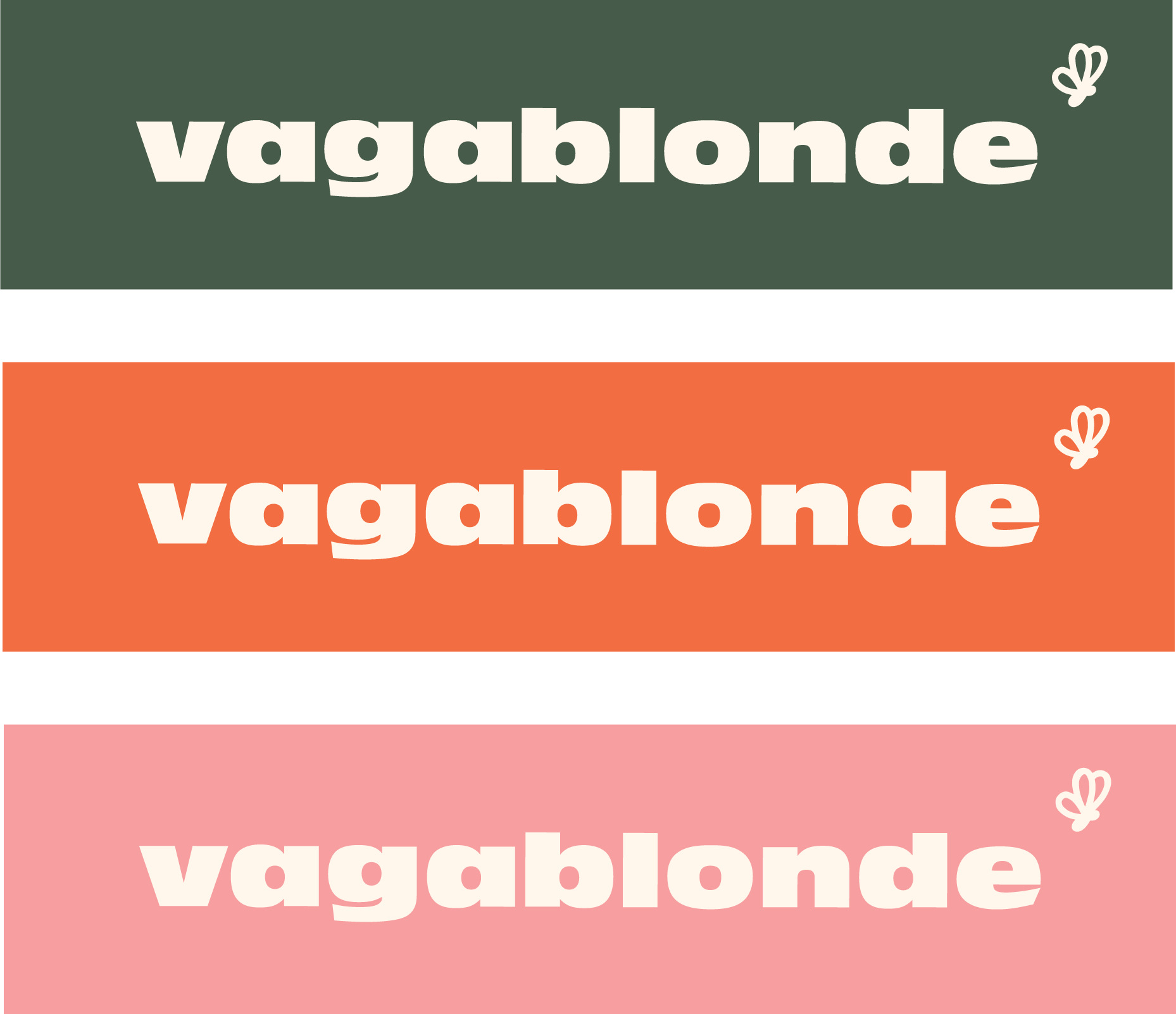
I chose a lowercase word mark using my header typeface, Antique Olive, complimented by a small butterfly graphic symbol to enhance recognizability and character. The lowercase style creates a friendly and approachable nature.
Here I included a few color variations which can be used across platforms and touch points.
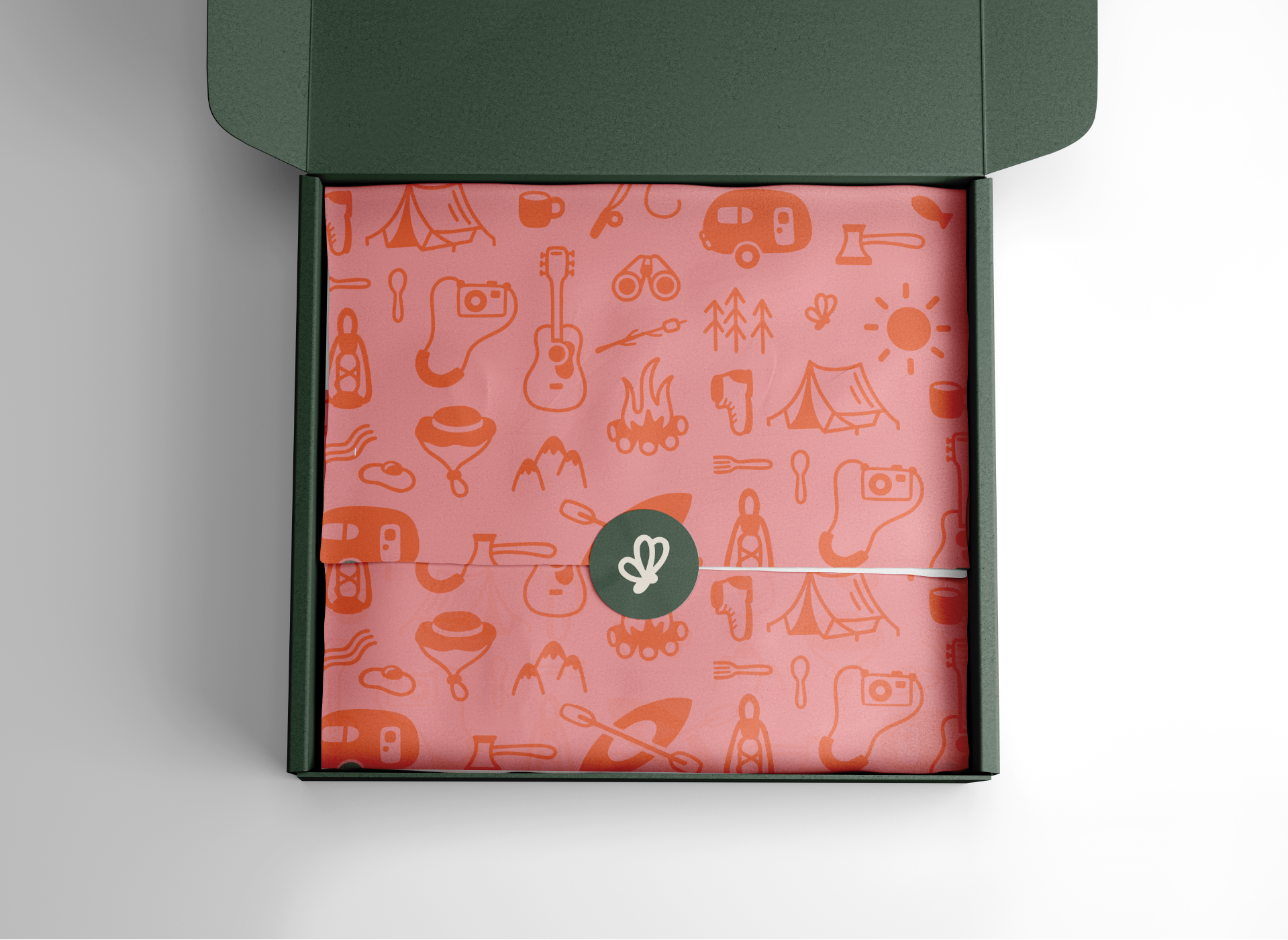
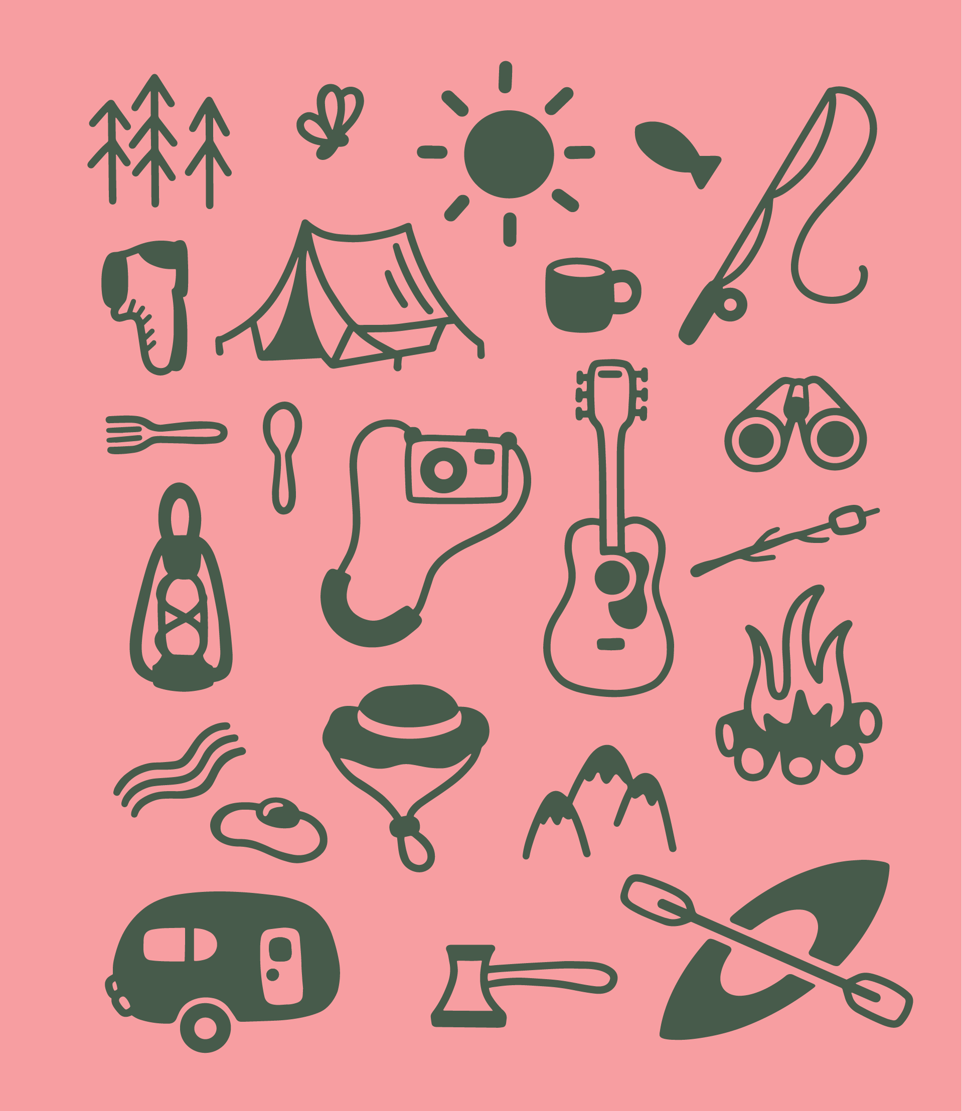
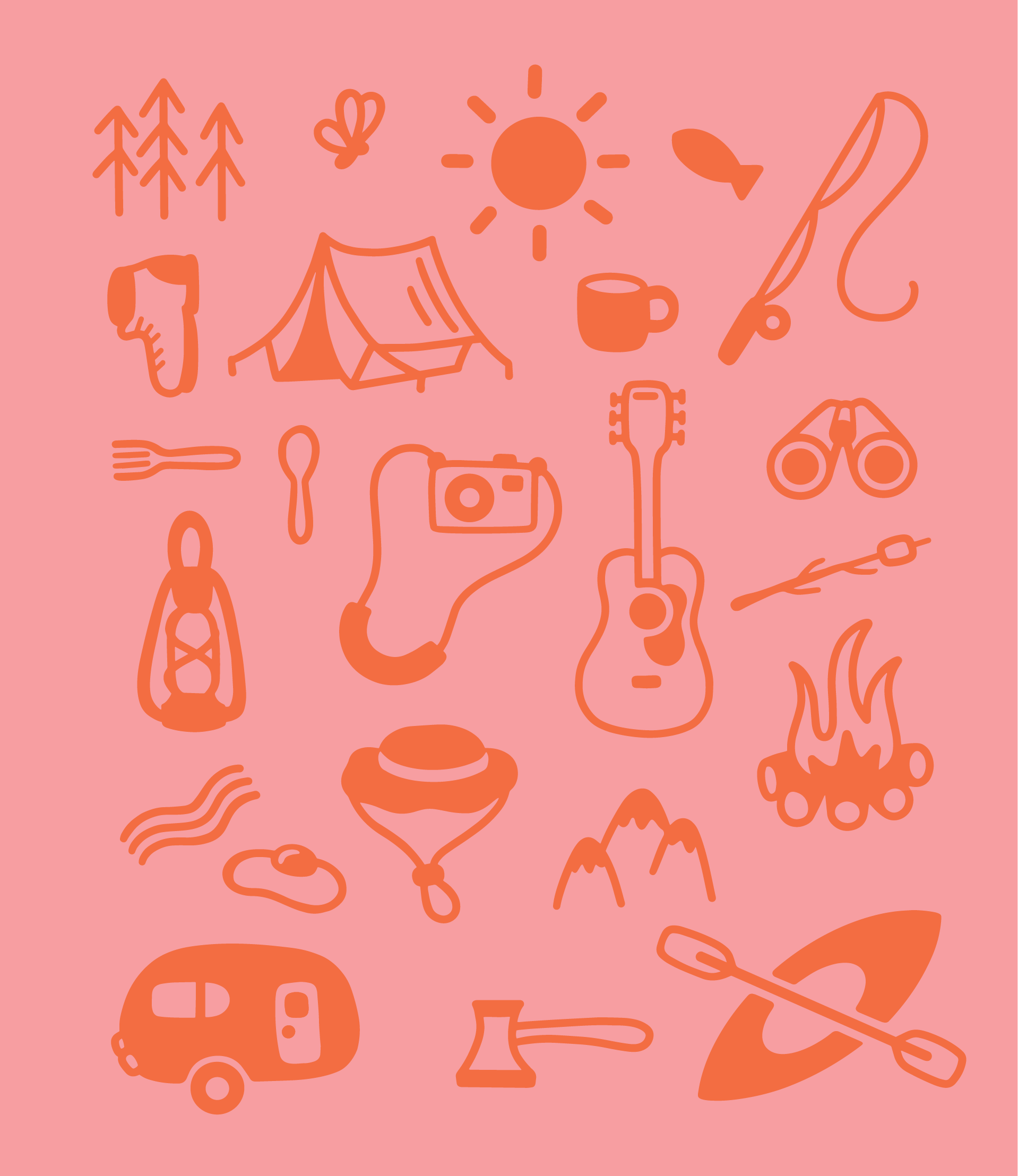
Using 2D flat illustrations, I created a pattern. These as a whole or the smaller designs within them can be used on packaging, advertisements, etc. for a playful touch.

Below you will see some mockups for packaging as well as business cards.
Opening a package is an important touch point for consumers to experience. I wanted the brand voice to be opinionated but fun - it should be consistent with the brand voice and messaging they see across all other channels, but also unique in that it's a special point in the customer journey, they're finally being introduced to your product and it deserves a proper unveiling.