


Brand & Identity Design - 2022
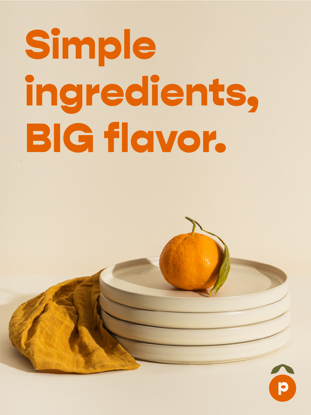
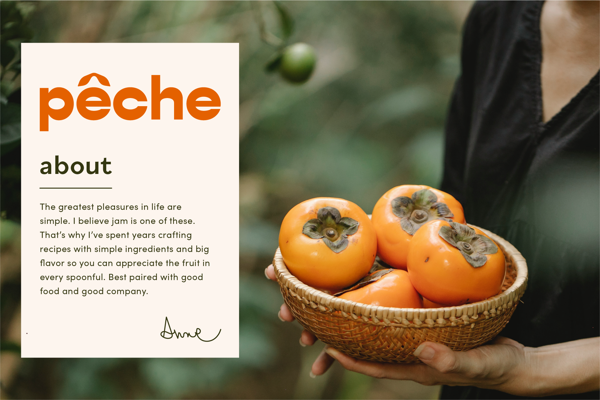
The greatest pleasures in life are simple.
I believe jam is one of these. That’s why I’ve spent years crafting recipes with simple ingredients and big flavor so you can appreciate the fruit itself in every spoonful. Best paired with good food and good company.
Aimed at individuals who want high quality, additive-free jam and have the budget flexibility for refined products. Most likely those between the ages of 25-50 who put extra time, money, and thought into preparation of food and where it's sourced.
Someone who might throw a dinner party or add a dollop of apricot jam to their gouda, for example.
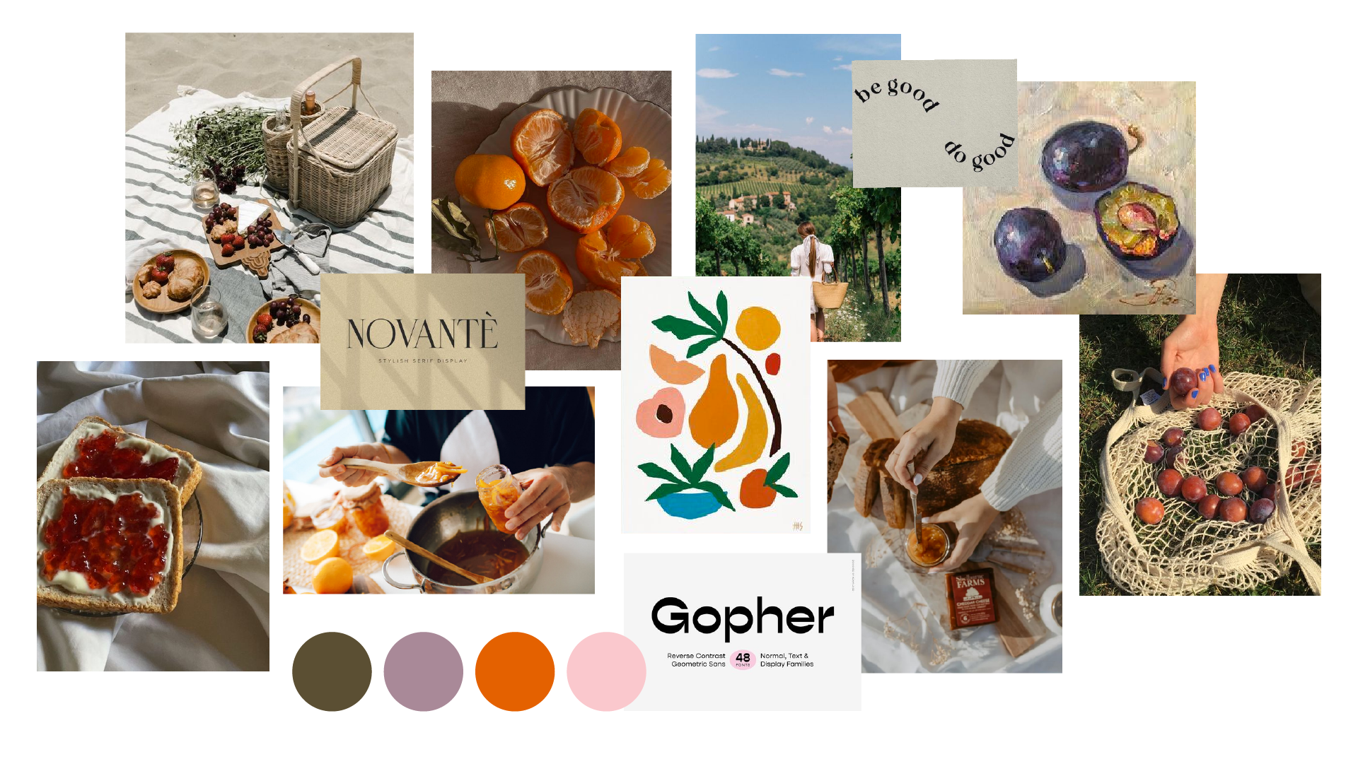
I created a mood board to gather inspiration for how the brand will be represented across touch points.
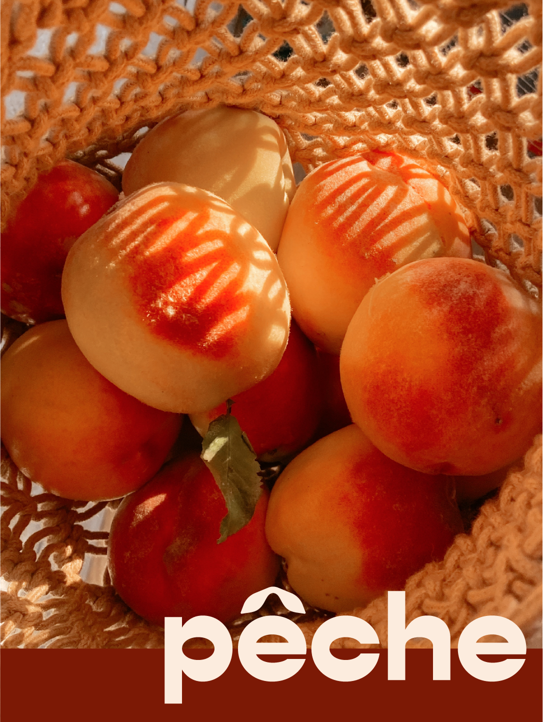
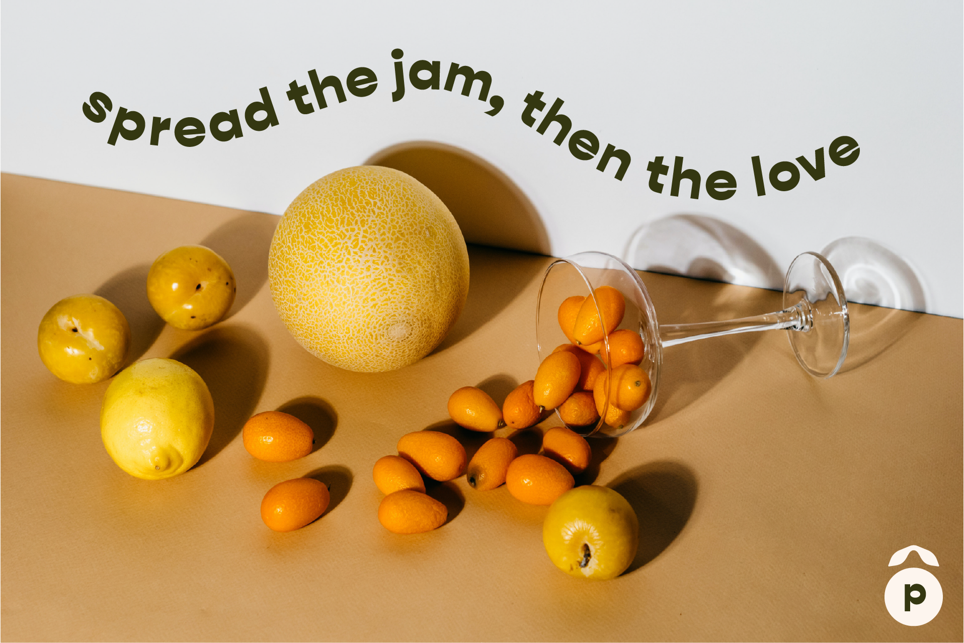
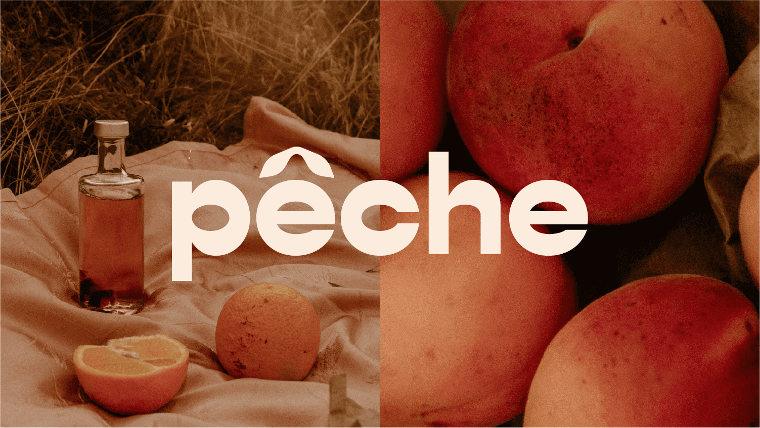
Drawing inspiration from the European countryside such as orchards and picnics. Our goal was for the brand to feel soft yet modern with natural textures and materials, complimented by the rich colors of fresh fruit.
An aspect of storytelling is incorporated by using images of fruit both when it's picked and as jam.
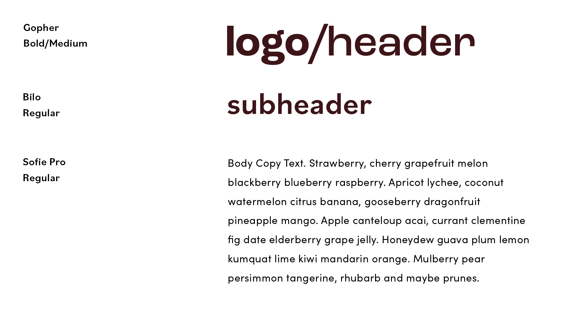
I try to choose typefaces that scale well across platforms while matching the personality and values of the brand.
Gopher: A modern sans serif with reverse contrast, this font is unique in its rounded letterforms and wide counter-spaces.
IvyPresto Display: This grotesque felt like the perfect sub-header as compliment to the letterforms of Antique Olive. The exaggerated ink traps and high contrast strokes gives a nod to the letterforms of our header - quirky while maintaining legibility.
Roc Grotesque: My choice for body copy font, it has a simple and clean feel which is ideal for product descriptions and smaller blocks of text.
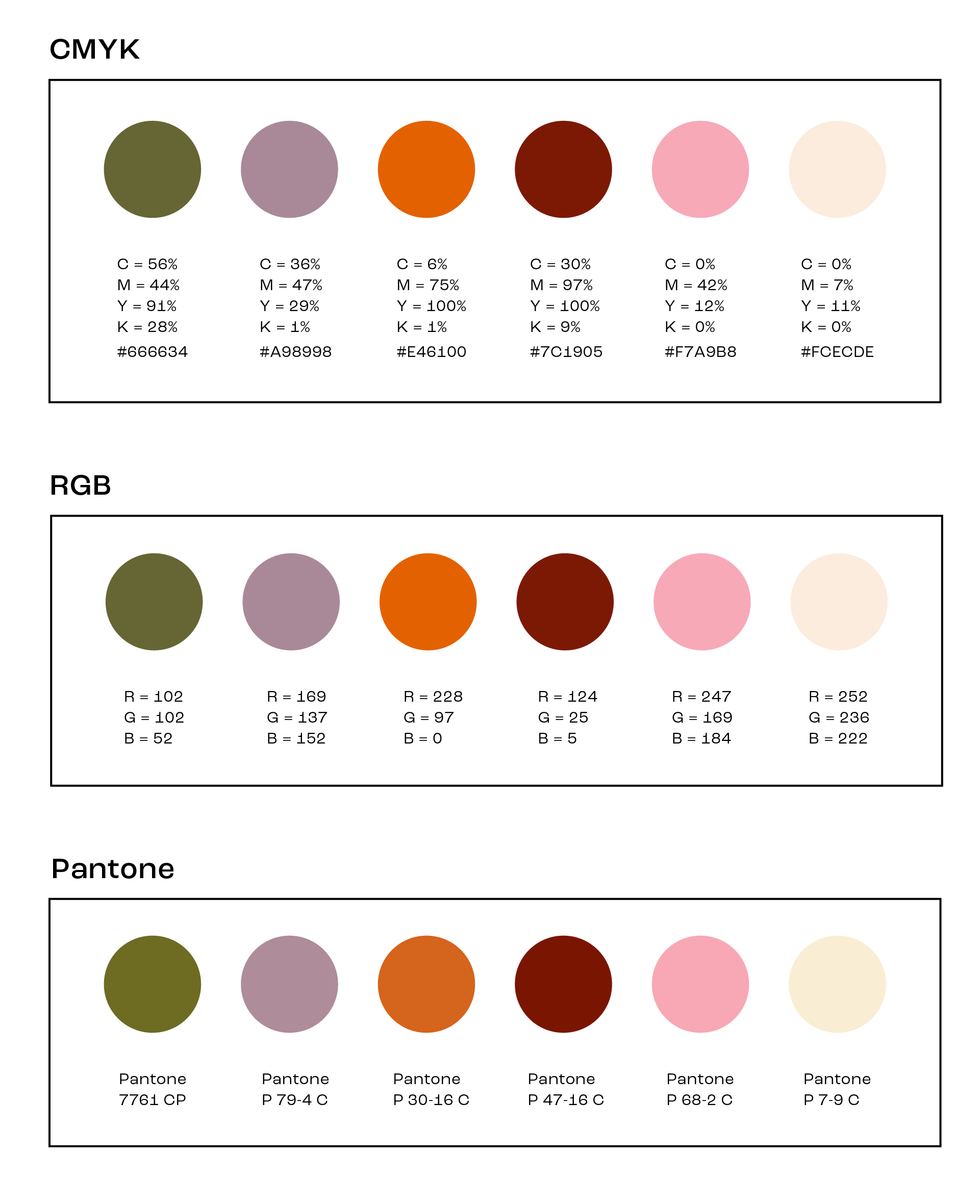
These colors define the feeling and tone of the brand across touch points.
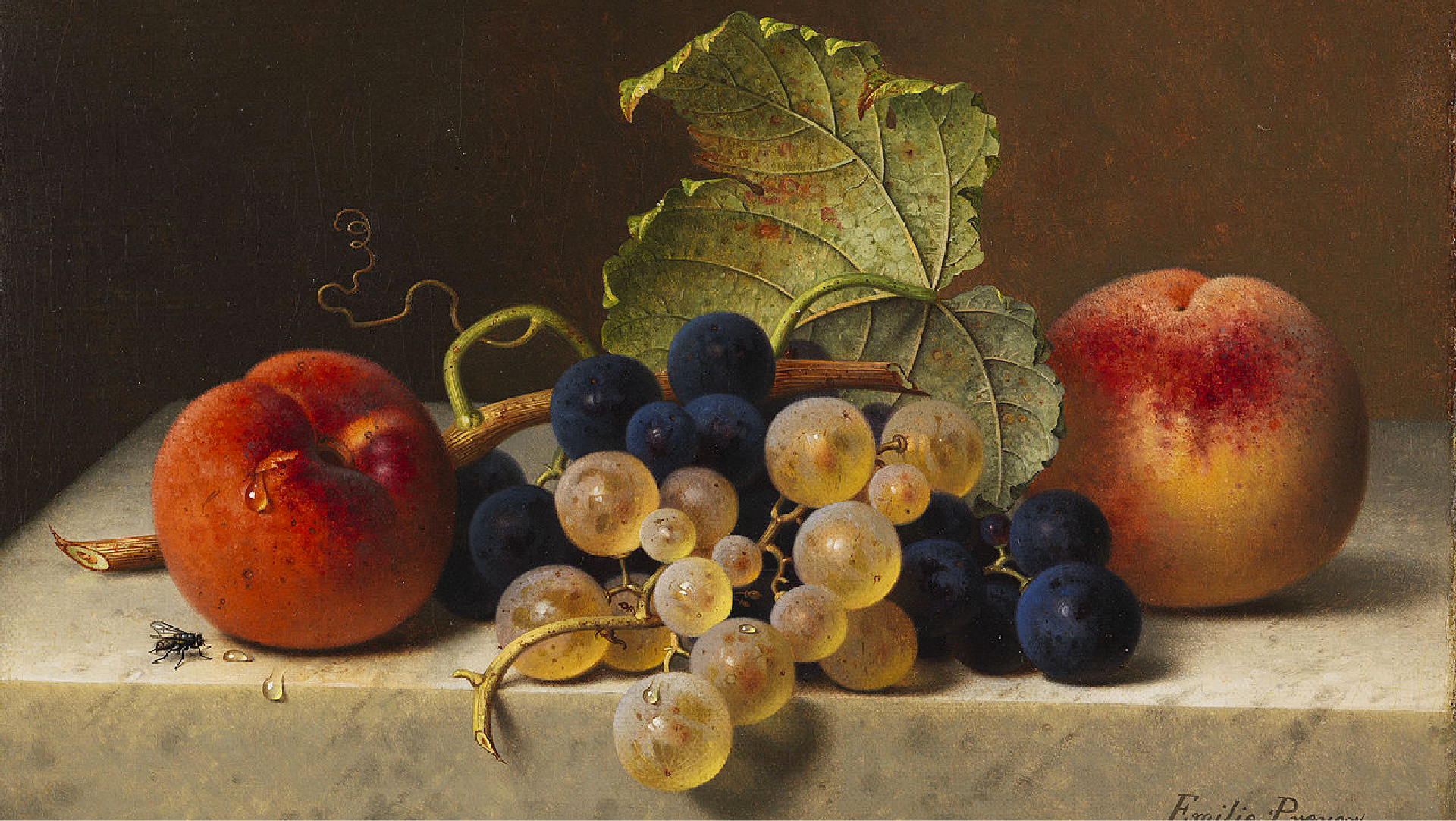
A hexad of warm tones is inspired by the colors found in still life fruit paintings - representing the rich, fresh flavor in these products.
The analogous relationship between violet, red, pink, and orange represents berry, citrus, and stone fruits.
Green acts as a compliment while evoking a sense of health that appeals to our ideal buyer.
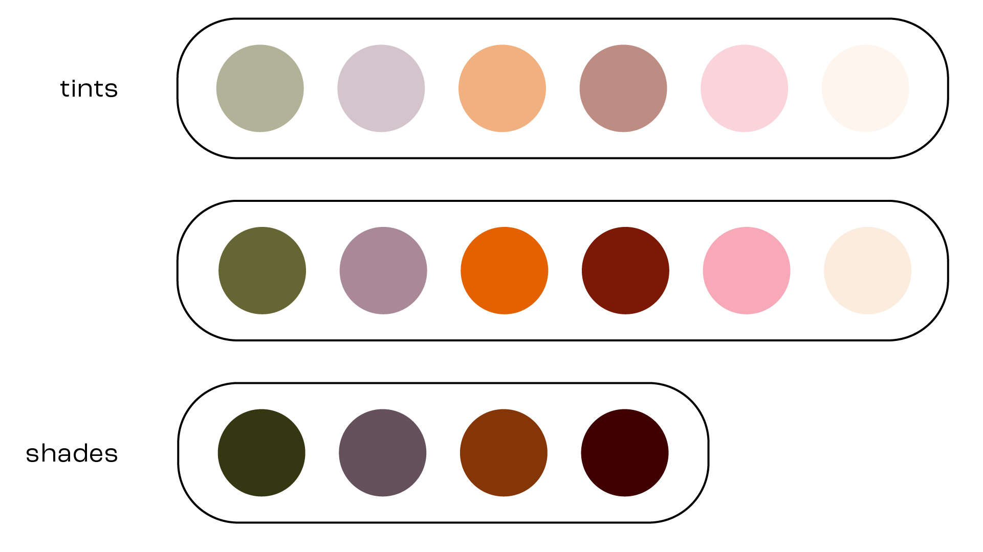
Tints and shades are developed below.
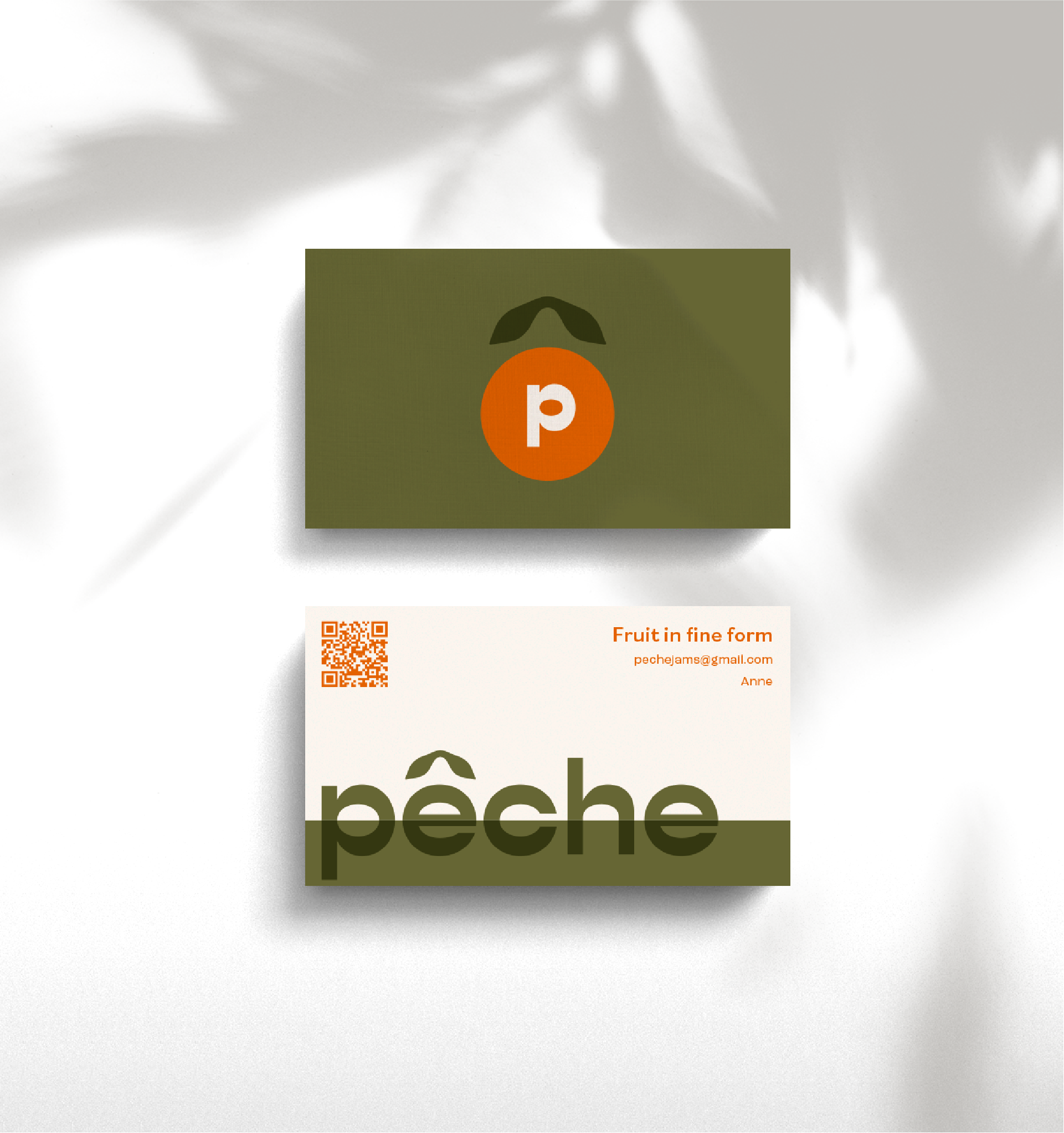
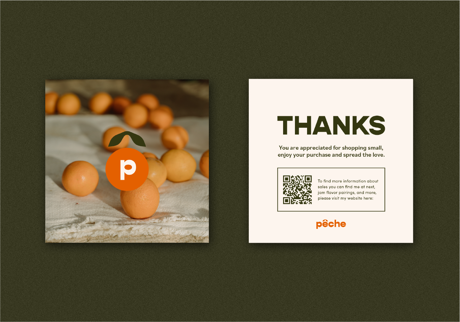
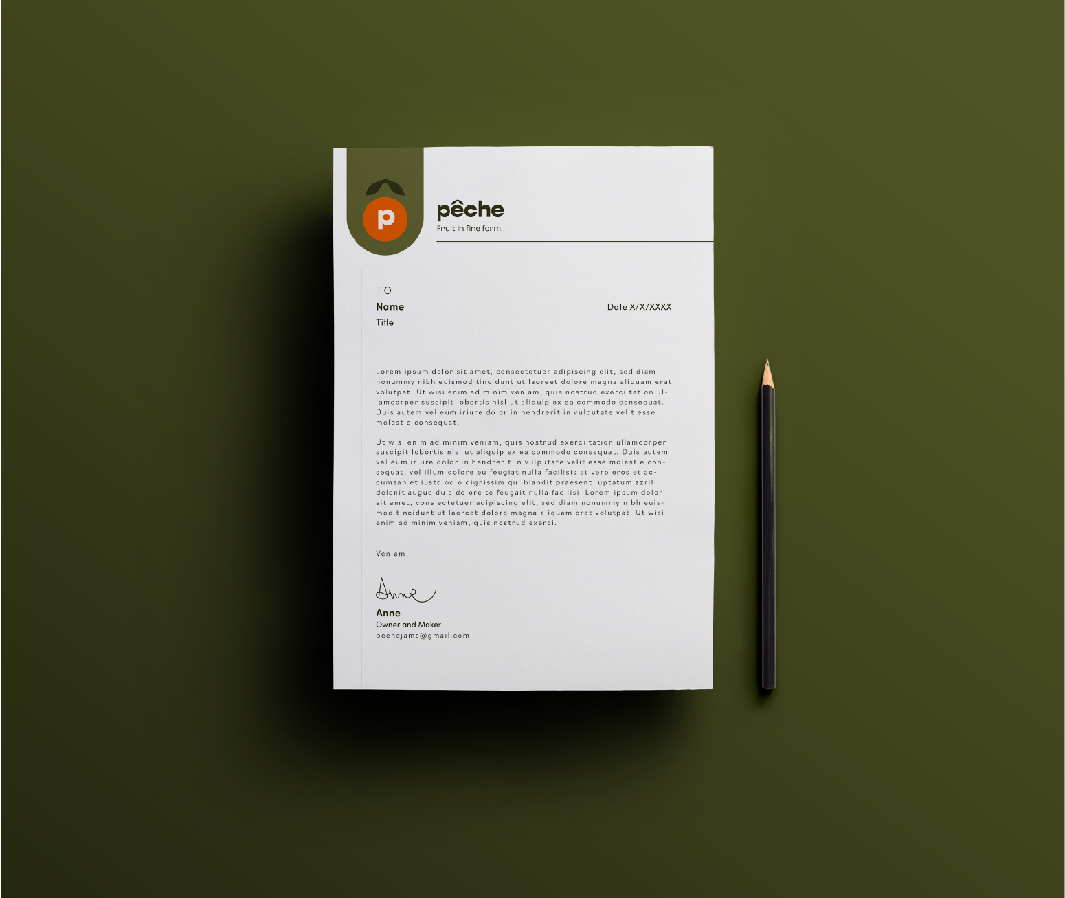
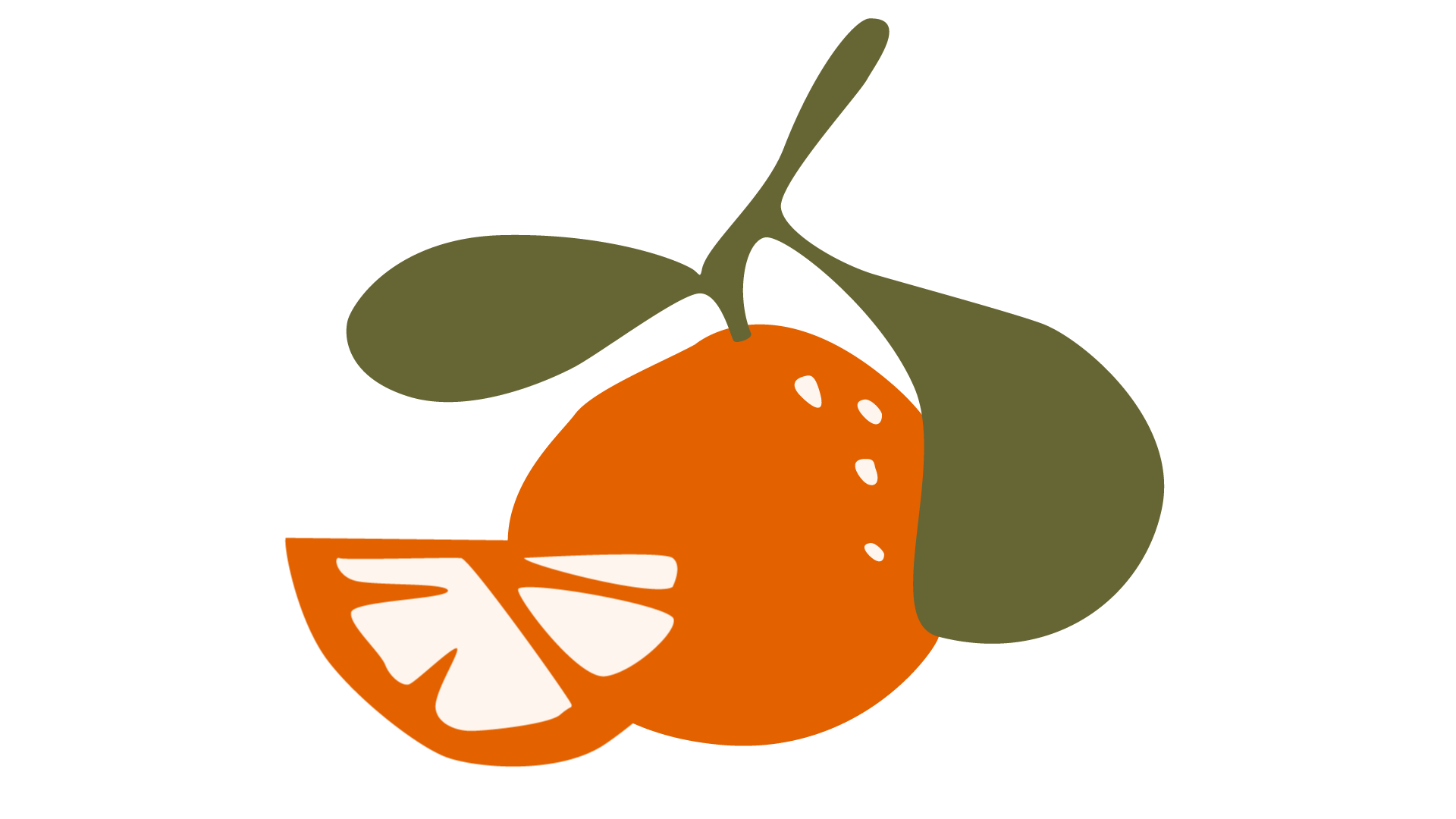
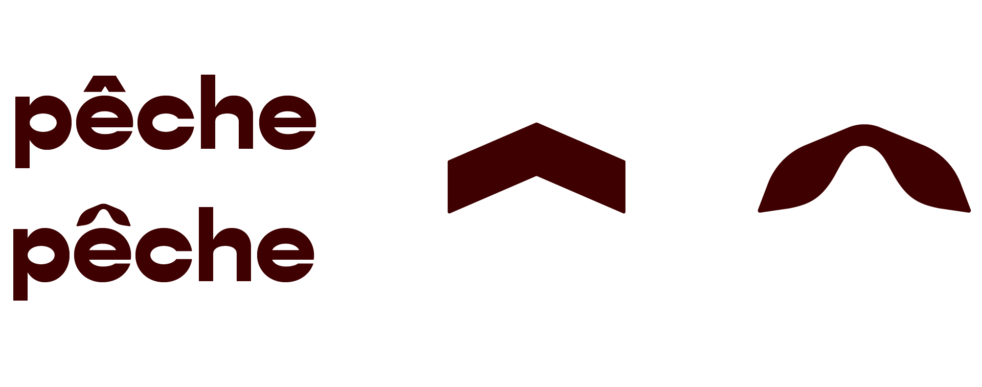
I created a simple lowercase wordmark logo using the Gopher Wide Bold font. I altered the form of the circumflex accent to a softer, rounded shape which resembles leaves; further hinting at fruit when placed above the rounded letterform of 'e'.
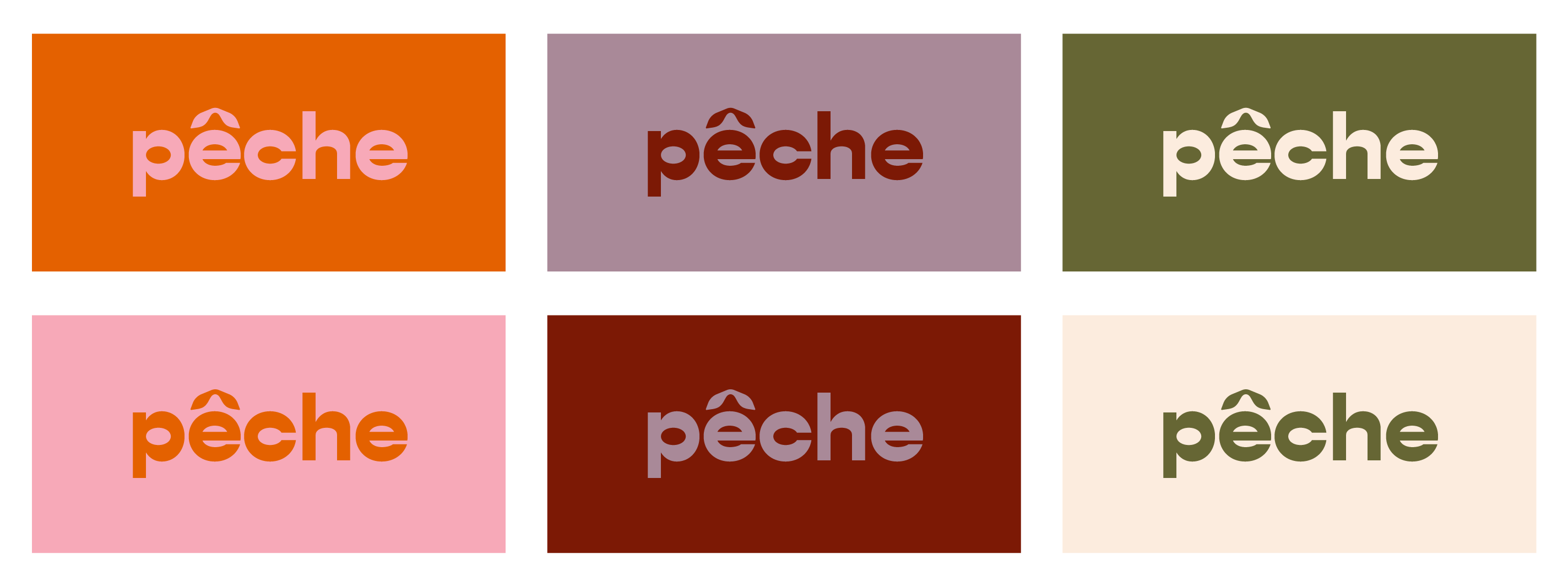
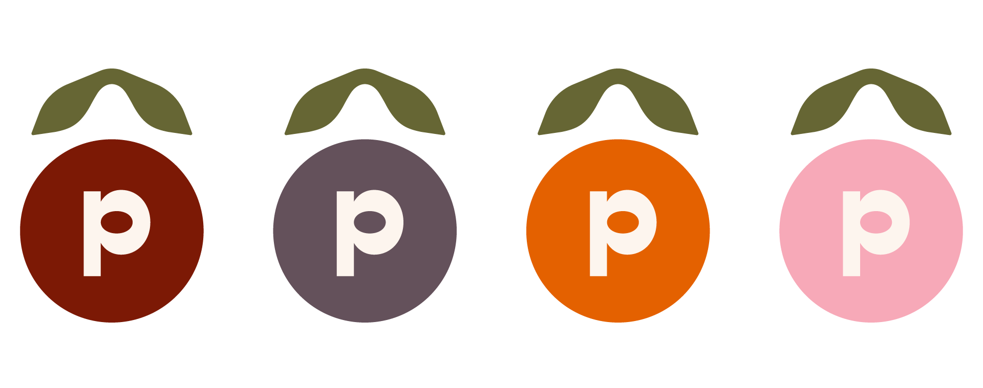
Pulling from the circumflex accent above the letter 'e' in the wordmark logo, I was able to create this icon in a variety of colors. This simplistic representation of fruit is easily recognizable when used on print collateral, social media posts, etc.
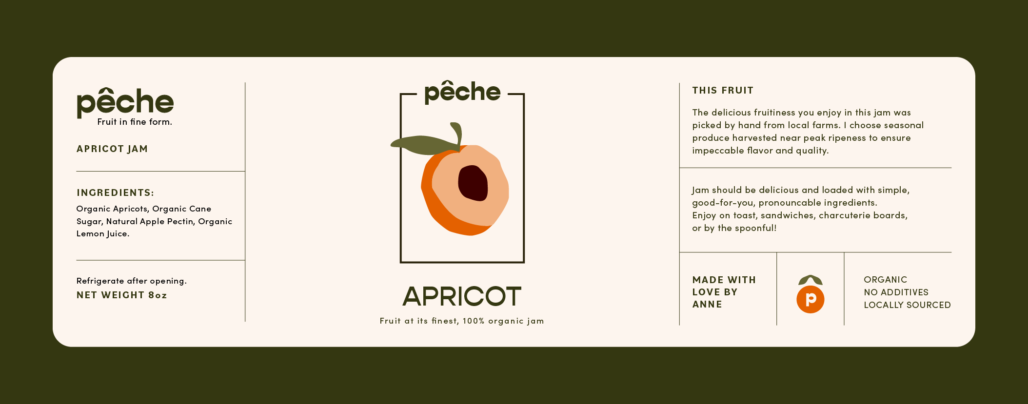
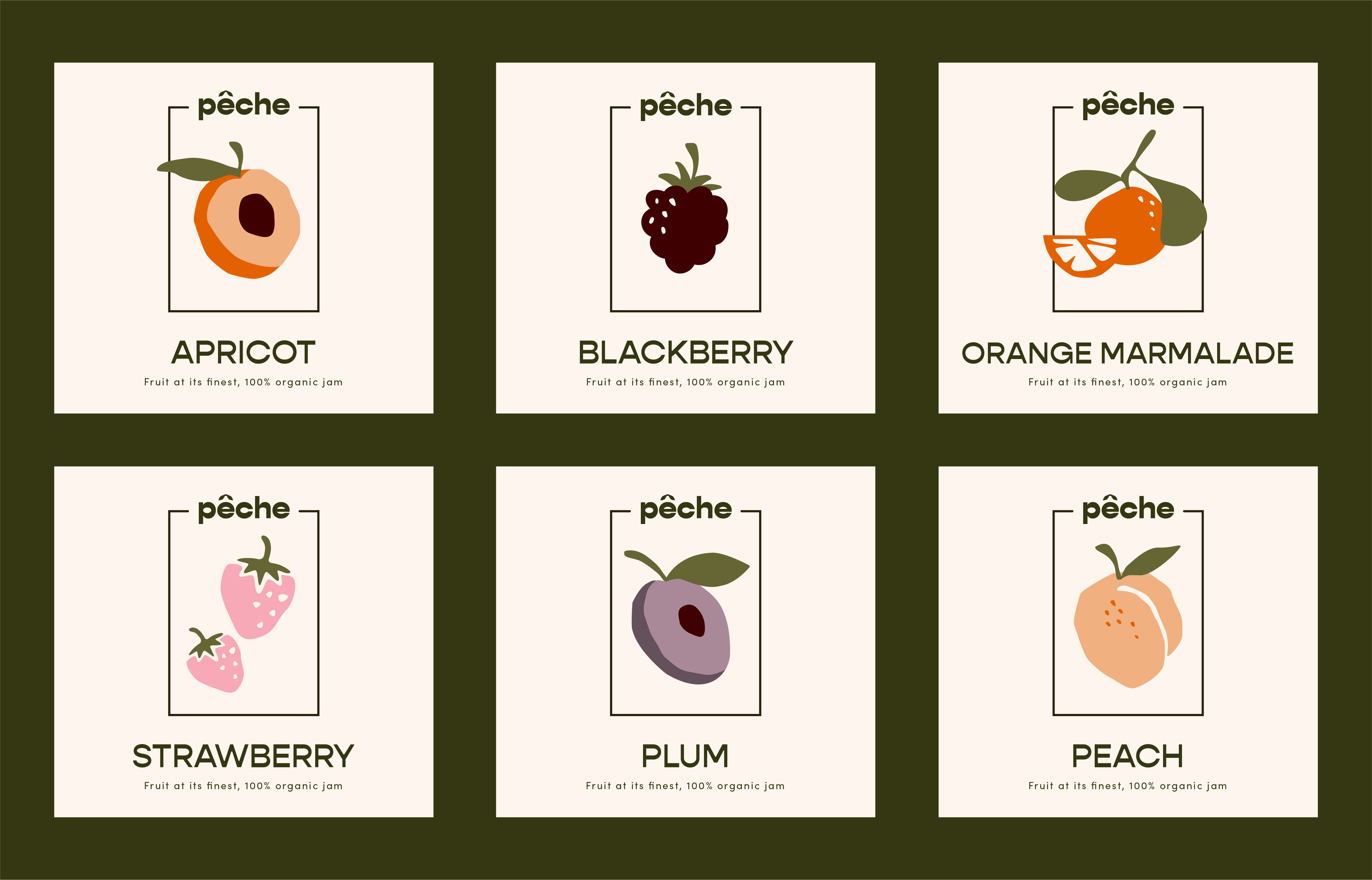
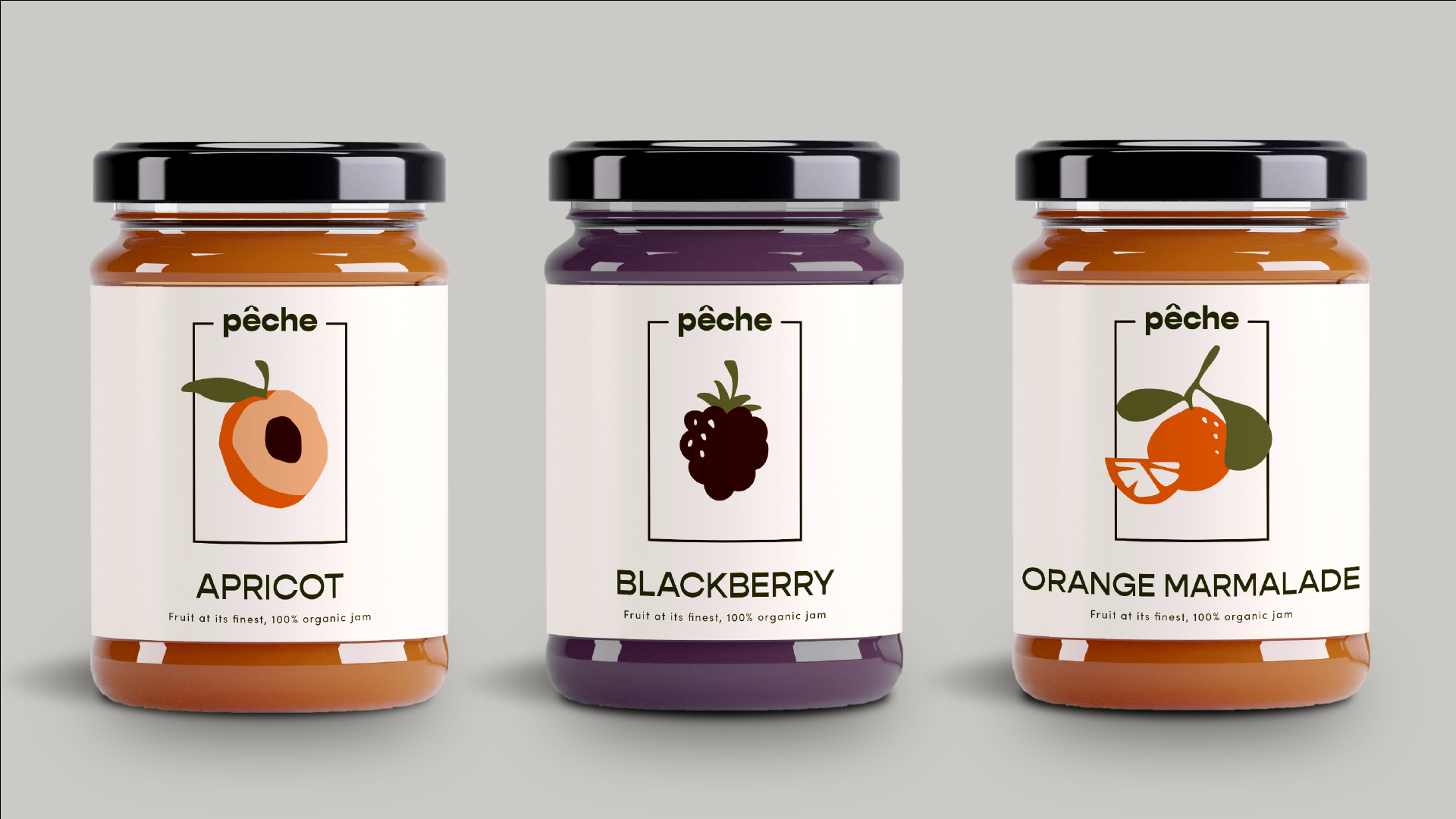
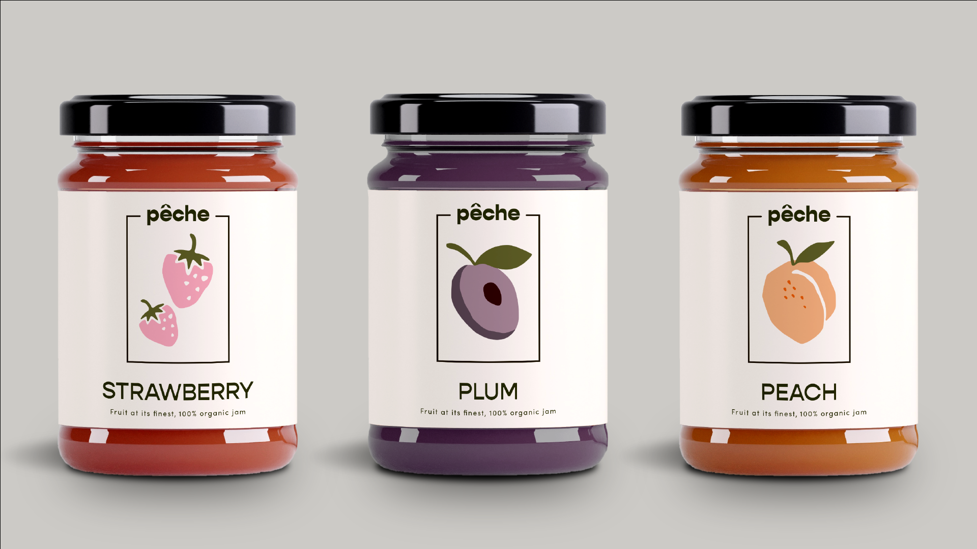
Below, I created a set of labels to be used on jam jars. Each flavor is represented with a flat fruit illustration within a thin rectangle for a clean, modern feel and added structure.
An off-white label with dark green lettering is much softer on the eyes than true white/black. It has an organic feel which reflects the quality of ingredients and values of the brand.
Fresh fruit is incorporated into print collateral such as posters, flyers, and business/thank you cards.